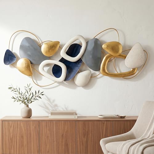
 Caleb Turner

Begin with a foundational principle: contrast creates harmony. The juxtaposition of rich shades of timber with bright, airy pieces can yield a stunning aesthetic. It’s essential to ensure that the warmth of the deep hues complements the coolness of lighter items. Select a dominant undertone in the timber to guide your choices; mahogany tends to radiate elegance while walnut conveys a more rustic appeal.
Incorporate textiles that bind these elements together, like cushions or throws featuring patterns that include both light and dark shades. This strategy not only enhances visual interest but also establishes a cohesive atmosphere. Focus on accessories such as lamps or artwork that reflect the color palette–think metallics or soft pastels that bridge the gap between these contrasting elements.


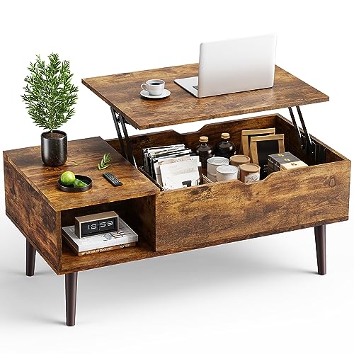
Consider balance in arrangement. For instance, placing a dark table alongside light seating allows each piece to stand out without overwhelming the space. If possible, add an area rug that brings together the two color schemes, creating an inviting zone that feels curated yet effortless. Always keep function in mind, ensuring that every element serves its purpose while contributing to the overall design.
Tips for Combining Deep Hues of Timber with Lighter Tones in Décor
I recommend choosing a neutral palette as a backdrop. This will allow the rich tones of the darker pieces to stand out without overwhelming the space. Opt for soft grays or creams on walls to create balance.
Incorporate textiles for added warmth; consider cushions or throws in muted colors that complement both styles. For instance, soft beige or taupe can bridge the gap, allowing the eye to transition smoothly between the different elements present.
Lighting plays a crucial role. Use warm tones from light fixtures to enhance the overall ambiance. Statement lamps or pendant lights with a mix of metals can harmonize the contrast between the two materials.
Add personal touches with artwork that includes both light and rich color schemes. This unifies the atmosphere while reflecting your taste and personality.
Accessorize thoughtfully; decorative items like vases, books, or picture frames can reflect both tonal choices. Choose items that have a combination of shades reflecting both darker and lighter themes for a cohesive look.
Finally, consider the proportions of the items; larger, darker pieces can dominate a room, so balance them with lighter, more delicate structures to achieve a visually appealing equilibrium.
Choosing the Right Shades of Dark Wood
Opt for deep hues like espresso or walnut to create a rich, grounding element in your space. These shades pair beautifully with lighter pieces, adding warmth and elegance.
Consider the undertones of the furniture. If the lighter elements lean towards cool tones, select darker materials with gray or cooler undertones. A dark ash or ebony finish would harmonize well in this scenario.
For a cohesive appearance, ensure that the selected dusky tones complement other design elements within the room. For example, mahogany introduces a classic touch, while a more modern charcoal could match contemporary accents.
In terms of texture, opting for matte finishes enhances the contrast against glossy surfaces, aiding in visual balance. This setup can add depth, making each piece stand out while still feeling connected.
Finally, remember to test samples in the space. Natural light can drastically alter how shades appear, so viewing them in situ will provide the best insight into their compatibility with existing colors.
Complementary Color Palettes for White Furniture
Choosing a complementary color palette enhances the appeal of bright pieces. I recommend focusing on tones that contrast yet harmonize well with light-colored items. Here are effective combinations:
- Cool Grays and Silver: These shades bring a modern touch, providing a sleek environment without overwhelming the eye.
- Soft Pastels: Colors such as mint green, blush pink, and lavender create a serene atmosphere, perfect for a relaxed space.
- Rich Jewel Tones: Deep emerald, sapphire blue, or ruby red add a luxurious feel while enhancing the visual interest around light elements.
- Soft Beige and Cream: These neutrals promote warmth, creating a cozy atmosphere that is inviting.
- Muted Earth Tones: Shades like rust or terracotta introduce a natural feel, grounding the room and enhancing organic materials.
Incorporating accessories in these hues can elevate the overall aesthetic, from cushions to artwork. Consider accent walls in complementary shades to create depth without clashing. Observing how light interacts with different colors can guide decisions on which palette brings out the best in your light pieces.
By balancing vibrant and neutral tones, I ensure that white items remain the focal point while creating an engaging and dynamic space.
Styles That Blend Dark Wood and White Furniture
Opt for a Scandinavian aesthetic by incorporating light-colored textiles and natural elements. This combination creates a harmonious balance, allowing the richness of deep grains to shine without overpowering the space.
Rustic Elegance
The rustic style emphasizes natural imperfections and artisanal craftsmanship. Introducing reclaimed or distressed accents enhances character. Pairing a dark-stained coffee table with creamy upholstered seating invites a cozy atmosphere while maintaining sophistication.
Modern Minimalism
A minimalist approach showcases sleek lines and uncluttered spaces. Choosing streamlined pieces in contrasting shades fosters an inviting yet chic environment. A smooth black credenza alongside bright, minimalist chairs serves as a statement without detracting from the overall serenity.
Incorporate metallic accents, such as gold or brass, to bridge the gap between contrasting tones. Light fixtures or decorative pieces can unify the ensemble, adding a touch of glam to the aesthetic.
Lastly, consider integrating greenery through plants. The vibrant essence of foliage softens the edges of stark contrasts, enhancing the overall tranquility of the décor. Greenery serves as a natural bridge, enhancing the interplay between the darker and lighter elements.
Utilizing Textures to Enhance Contrast
Incorporate various textures to create visual interest and depth. For instance, pairing a sleek, glossy finish on your light-colored items with a more rugged or matte surface on the darker elements adds an appealing dynamic. Consider materials like velvet, linen, or natural fibers for the lighter pieces, while opting for finishes such as reclaimed surfaces or brushed metal for the darker aspects.
Layering Textures
Layering different textures–like a plush white rug beneath a robust wooden coffee table–further accentuates the stark difference between the two materials. This contrast not only draws the eye but also invites touch, making the space feel warm and welcoming.
Accessorizing for Balance
Utilize accessories to introduce additional textures. For example, ceramic vases or woven baskets can enhance the atmosphere when paired with both types of furnishings. A mix of shiny and matte items in decorative pieces can also bridge the gap between the two styles, creating a cohesive yet varied aesthetic.
Placement Tips for Balanced Visuals
Begin by utilizing an intentional arrangement that creates equilibrium. Place darker elements at lower levels, such as a sturdy coffee table or shelving, to enhance stability. Meanwhile, position lighter pieces, like a sleek armchair or cushions, at varying heights to draw the eye upwards.
- Balance the dimensions: Ensure that larger, darker items are paired with smaller, lighter counterparts to avoid overwhelming the space.
- Group items in odd numbers: This approach naturally attracts attention and makes arrangements feel more cohesive.
- Embrace open spaces: Avoid clutter by leaving empty areas around lighter accents, allowing them to stand out and invite visual flow.
Consider the weight of textures. Combining materials like metal or glass with heavier surfaces can provide a refreshing contrast while maintaining harmony. Use textural elements in complementary shades to ensure they work well together.
- Experiment with layering: Place a soft, light rug beneath darker seating to create a distinct zone.
- Leverage lighting: Use bright fixtures to illuminate lighter pieces, enhancing their prominence and creating a warm ambiance.
- Place artwork strategically: Hang art with bold colors against lighter backgrounds to tie the elements together while maintaining visual interest.
Lastly, regularly reassess your setup. Small adjustments can significantly impact the overall aesthetic, ensuring the arrangement remains inviting and balanced over time.
Incorporating Accessories to Tie the Look Together
To create a cohesive aesthetic that harmonizes the richness of darker tones with lighter elements, I recommend using accessories as focal points that bridge the two styles. Select textiles such as throw pillows or blankets that incorporate shades from both color families. For example, a cushion with varying hues that reflect both the deep and light shades can seamlessly integrate the elements.
Incorporate metallics or natural materials, such as brass or jute, for decorative accents. The shine from metallics can enhance the brightness of light pieces while providing a striking contrast to darker elements. I find that sculptural pieces in these finishes act as visual anchors.
Lighting plays a crucial role; opt for lamps or chandeliers that feature both color tones. A fixture with a mix of dark bases and light shades can balance the overall color scheme while adding elegance to the space. Ensuring that different light sources are evenly distributed will enhance the ambiance.
Artwork also serves as a strong unifier. Choose pieces that incorporate both the darker woods and lighter colors; a canvas with a blend of both will draw the eye and create a sense of continuity. Framing artwork in complementary finishes can solidify the integration of the two palettes.
| Accessory Type | Recommended Materials | Color Integration |
|---|---|---|
| Textiles | Cotton, Wool | Mixing hues from dark and light |
| Decorative Accents | Brass, Jute | Contrast with gleaming and natural finishes |
| Lighting Fixtures | Metal, Fabric | Combining dark bases with light shades |
| Artwork | Canvas, Framing Material | Incorporating both palettes in visuals |
Consider plants or florals in neutral or complementary pots to soften the lines between contrasting elements. Greenery can bring freshness and life, connecting the color families organically. Layering these accessories strategically throughout the space will create a visually appealing and harmonious environment.
Maintaining Harmony with Flooring Choices
I recommend selecting flooring that complements your chosen color scheme while reinforcing the connection between the elements in the room. For instance, light oak or maple finishes can provide a natural continuity when paired with crisp, bright pieces, highlighting their clean lines.
If opting for a darker flooring option, consider rich cappuccino or mahogany tones. These shades work best when they have a subtle sheen that reflects light, creating a dynamic interplay with brighter elements. A satin finish will help maintain a modern look, ensuring the area feels open and inviting.
Mixing textures can enhance the overall aesthetic feel. For example, a smooth, polished surface can contrast beautifully with a soft area rug that adds warmth. I often pair rugs in neutral tones or gentle patterns to tie everything together, allowing the stronger hues to stand out without overwhelming the space.
Additionally, maintaining consistency throughout the environment is vital. If your flooring has visible grains or patterns, choose decor that resonates with those details. This creates a cohesive theme that pulls the room together seamlessly.
I also find that integrating transition strips or thresholds in complementary colors can provide a visual link between different spaces, ensuring each room echoes elements from one another. This consideration fosters a more unified design throughout your home.
Avoiding Common Mistakes in Mixing Materials
One common oversight is underestimating the impact of scale. Pairing large, bulky pieces with slim, delicate items creates visual discord. Ensure that the proportions of each element complement one another.
An inclination to use diverse finishes can lead to a chaotic atmosphere. Stick to a cohesive finish palette to maintain fluidity. For example, if you select a matte texture for one item, opt for similar finishes in other pieces.
I often see individuals neglecting the power of contrast in visual appeal. Balancing lighter tones with darker accents can enhance depth. Use textiles, cushions, or decorative elements to introduce gradual transitions between shades, avoiding harsh contrasts.
Placement can also derail the aesthetic. Avoid crowding spaces with too many close elements. Allow for breathing room so each piece can stand out while still contributing to an integrated look.
Ignoring the importance of maintenance can lead to unsightly wear over time. Consider the practicality of selected materials. Opt for finishes that are durable and easy to maintain to keep your environment looking pristine.
Don’t forget about the influence of lighting. Ambient illumination can drastically change the appearance of materials. Ensure that your lighting choices enhance the visual qualities of both finishes without creating an overwhelming glare.
Lastly, failing to incorporate personal touches can render the space void of character. Use artwork, plants, or decorative accessories that resonate with your personal style while harmonizing with the chosen materials.