
 Caleb Turner

I recommend opting for soft pastels or muted tones. Light shades such as pale blue, soft lavender, or gentle peach effectively contrast with charcoal, enhancing the space’s overall aesthetic. These hues create a serene atmosphere while allowing the darker pieces to stand out uniquely.
If a more dramatic effect is desired, consider deep navy or rich jewel tones like emerald or burgundy. These choices provide a bold backdrop that highlights the sleekness of charcoal while adding depth and sophistication. Such darker shades can make the space feel warm and inviting without overwhelming it.
If a clean, modern vibe is preferred, sticking to crisp whites or light greys is ideal. These shades create a seamless look, allowing furnishings to blend harmoniously with the surrounding decor. Pairing lightly tinted walls with charcoal accents results in a chic and minimalist environment.
Finally, adding texture using wallpaper or paint techniques can elevate the design. Textured finishes or subtle patterns in neutral tones can add interest without clashing with darker furnishings. This approach maintains a cohesive look while providing an opportunity for creative expression.
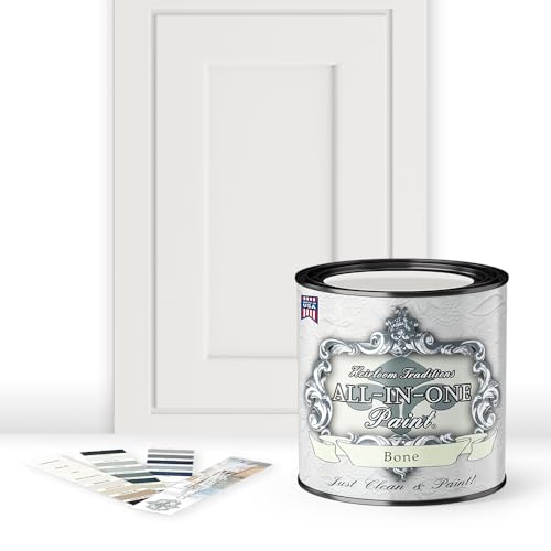


Ideal Shades to Complement Charcoal Seating
For the sophisticated pairing with dark upholstery, consider these beautiful options:
- Soft White: A creamy or warm white enhances brightness without overpowering muted tones.
- Cool Beige: This neutral introduces warmth while adding a hint of gray undertone, creating a balanced atmosphere.
- Dusty Blue: A pale blue can evoke tranquility, making the space feel open while contrasting subtly with the darker pieces.
- Earthy Sage: This greenish hue provides a refreshing yet subdued backdrop that harmonizes seamlessly.
- Warm Taupe: Rich yet soft, taupe complements dark hues effectively by adding depth and warmth.
When selecting options, consider the room’s lighting. Natural light can impact the appearance of each shade, so testing paint samples on the walls is recommended. Additionally, pairing with contrasting elements such as art or decor can enhance the overall design.
A clear vision of how these tones play together will create a cohesive look, allowing your seating to take center stage while still contributing to an inviting atmosphere.
Choosing the Right Shade of White for Contrast
Opt for a soft, warm white, like off-white or creamy shades, to create a cozy atmosphere that highlights the cool tones of my items. These hues offer a subtle contrast, allowing the furnishings to stand out without overwhelming the space.
Bright whites can be striking, but they may clash with the muted shades of my decor. Instead, I prefer whites that carry undertones of yellow, beige, or gray, enhancing the overall aesthetic while complementing the contemporary look.
Consider samples on the wall to observe how lighting affects the appearance throughout the day. A slightly tinted white during different times enhances the depth and richness, making my space feel more inviting.
For modern aesthetics, pairing my items with a chalky white can create an appealing soft backdrop. This choice balances sophistication and approachability, ensuring the room feels stylish yet homely.
Accent trims in a brighter white can add definition, framing my pieces beautifully and ensuring they remain the focal point. By carefully selecting the right shade, I can achieve an elegant contrast that enhances the entire environment.
Best Accent Colors to Compliment Grey Furniture
Rich yellows create a striking contrast that energizes a space. Pair warm, sunny hues with cooler tones of your seating or tables for balance. Soft mustard or bold saffron can soften the overall look while adding warmth.
Deep Blue Tones
Dark navy or teal accents elevate sophistication. These shades not only anchor the room but also introduce an element of depth. Consider pillows or artwork in these shades to create a coastal or modern aesthetic.
Earthy Greens and Terracotta
Natural greens bring tranquility, while terracotta adds warmth. Olive or sage combined with an accent of burnt orange contribute to a relaxed, inviting atmosphere. Accessories like plants or pottery in these tones can tie the entire room together.
Using Bold Colors with Grey: Do’s and Don’ts
Choose deep, rich shades like navy, emerald, or burgundy as backdrops to create a striking balance with muted tones. These hues not only add drama but also enrich the overall aesthetic. Pair them with lighter accents in accessories or artwork to keep the environment lively.
Avoid overly bright or neon tones, as they can overwhelm and clash with the subtlety of cooler hues. Instead, opt for warmer, more subdued tints like mustard or rust to harmonize without competing.
Incorporate bold elements through accent pieces, such as cushions, rugs, or wall art. This approach allows flexibility and facilitates easy changes when you crave a refresh without a complete overhaul.
Be mindful of saturation; a single statement wall in a bold hue can provide impact, whereas an entire room painted in vivid shades might provoke unease. Balance is key.
Layering different textures with bold colors can create depth. Consider mixing plush fabrics with smooth finishes to enhance the visual appeal and comfort.
Use contrasting lighting to highlight bold choices, ensuring the atmosphere feels inviting. Soft, warm bulbs soften harsh contrasts, creating an inviting focal point.
Ultimately, test samples on your surfaces. Different lighting conditions can significantly alter your perception of a shade, so observe it throughout the day before making final decisions.
Neutral Color Palettes That Work Well with Grey
Choose soft taupe or warm beige shades to create a cozy atmosphere. These hues harmonize beautifully with cool tones, providing balance and warmth, resulting in a soothing environment.
Consider a soft ivory or cream for a fresh touch. This light backdrop enhances the elegance of your pieces while ensuring the space remains bright and airy.
Light greige blends grey and beige, making it an ideal option for complementing varied designs. This versatile tone brings depth without overwhelming the visual aesthetic.
For a more dramatic yet neutral choice, opt for a rich, deep charcoal. It adds sophistication and enhances the modernity of your items, creating a striking yet subtle contrast.
In any setting, layering textures with these muted shades will augment visual interest. Complement with soft fabrics and natural materials to elevate the overall look seamlessly.
Impact of Lighting on Wall Color Choices
For optimal results, I recommend considering natural light exposure and artificial sources when selecting hues. Rooms with abundant daylight respond well to softer shades; they can enhance warmth and create a calming atmosphere. Conversely, in dimly lit spaces, vibrant tones energize the environment, ensuring the area feels lively and inviting.
When choosing pigments, assess the direction of your windows. North-facing rooms may benefit from warmer, off-white tones to counter the cool, blue light. Meanwhile, southern exposures can handle bold statements, as they usually receive ample sunshine throughout the day.
Artificial lighting also alters perception. Incandescent bulbs lend a cozy glow, making cooler shades more appealing, while LED lights may accentuate brightness, pushing for deeper tones for contrast. Test different options to see how they influence the chosen palette.
Lastly, monitor seasonal changes in light. Winter’s low sun might demand warmer shades, whereas summer’s intense rays suit cooler tones. Keeping these factors in mind will refine the selection process, ensuring that the space feels harmonious and inviting throughout the year.
Creating a Cozy Atmosphere with Warm Colors
To infuse a space with warmth, opt for shades like soft beige, terracotta, or muted yellows. These tones not only harmonize beautifully with cool-toned pieces but also create an inviting atmosphere. A warm palette contrasts elegantly with the chill of neutral seating, enhancing the overall feel of a room.
Consider strategic placement of furnishings against walls painted in these inviting hues. For instance, pairing a rich cream with deep mahogany accents can showcase the resiliency of soft textures while giving a homely vibe. Light warm shades can also brighten smaller areas, making them feel spacious yet intimate.
| Warm Paint Options | Best Pairings |
|---|---|
| Soft Beige | White accents, dark woods |
| Terracotta | Green plants, rustic metals |
| Muted Yellow | Grey tones, natural textures |
Incorporating these hues can create a seamless flow, encouraging relaxation. Textures like wool or heavy drapes complement warm tones and add further coziness. Accents in warmer shades of reds or oranges can also enhance this environment without overwhelming the aesthetic. Focus on creating balance while introducing layers through textiles and accessories.
Regularly assess how light changes the mood and warmth of your chosen palette throughout the day. A paint sample on the wall can help visualize how sunlight affects the nuance, ensuring comfort at any hour. Combining warm shades with thoughtful lighting solutions can elevate the ambiance, transforming your space into a comforting retreat.
When to Use Dark Colors with Grey Furniture
Applying deep hues alongside charcoal or stone tones works exceptionally well in specific settings. For a dramatic look, I choose navy or emerald green, which juxtapose beautifully against the subtlety of grey. These bold shades create an elegant and sophisticated environment, perfect for living rooms or master bedrooms.
In smaller spaces, utilizing darker shades can add depth. I opt for rich tones, ensuring adequate lighting is present to prevent the area from feeling cramped. Incorporating mirrors enhances the effect, reflecting light while emphasizing the contrast of both textures and shades.
Accent walls serve as a focal point, allowing a darker tone to stand out without overwhelming the room. This approach highlights the sleekness of the furniture while maintaining a cozy atmosphere. I often pair dark tones with metallic or glass accents, which elevate the aesthetic without competing.
Lastly, pay attention to the type of natural light in the room. North-facing rooms receive cooler light, making them suitable for warmer deep tones, while south-facing spaces thrive with cooler dark shades. This consideration ensures the overall look remains balanced and inviting.


