To achieve a harmonious look, consider using deep greens, soft blues, or warm greys alongside your oak items. These shades create a serene and inviting atmosphere, allowing the natural grain of the wood to shine.
For a more contemporary feel, muted pastels like blush pink or light lavender can add a touch of elegance while maintaining balance. They contrast beautifully with the earthy tones of the timber, offering a fresh perspective without overwhelming the space.
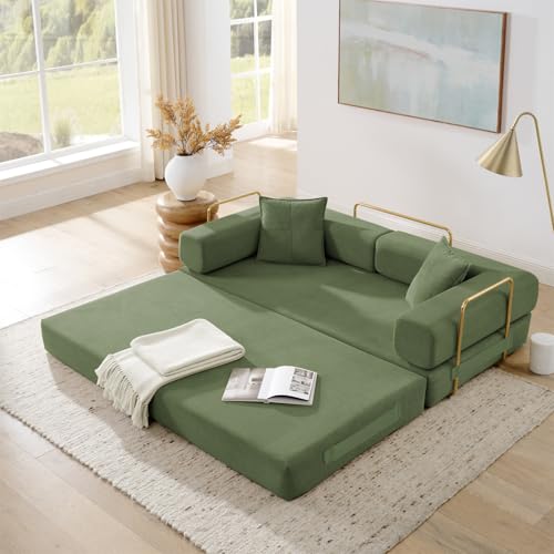
Accenting with bold shades, such as navy or charcoal, brings a modern edge. These darker hues provide a striking backdrop, enhancing the richness of the wood’s finish. It’s a refined choice that can elevate any room’s aesthetic.
Lastly, incorporating crisp whites or soft creams as complementary tones can brighten the environment, creating a classic and timeless appeal. This approach pairs seamlessly with oak, emphasizing its natural beauty while maintaining an airy feel.


Complementary Hues for Wood Pieces
Choosing rich earthy tones such as deep greens or terracotta creates a warm ambiance that enhances the natural grain of the wood. Pairing muted shades like soft greys or taupes promotes a serene environment, allowing the texture of the timber to stand out.
For a modern twist, incorporating blues or navy gives a fresh contrast while maintaining a sophisticated feel. Accent pieces in burnt orange or mustard yellow can also inject energy and playfulness into the decor.
A monochromatic palette featuring varying shades of beige or cream provides an elegant backdrop, balancing the rustic charm of the wood. Pairing with darker hues, like charcoal or espresso, offers depth and character, creating a striking visual appeal.
Incorporating metallic elements such as brass or bronze light fixtures adds a touch of glamour, while remaining complementary to the warm undertones of the natural material.
Plant life adds vibrant greens, whether through foliage or decorative pots, introducing a sense of life and color without overwhelming the space.
Understanding Oak Grain Patterns and Their Influence on Color Choices
Focusing on grain characteristics helps in selecting complementary hues for your pieces. Oak varieties, such as red and white, feature distinct patterns that can influence the atmosphere of a space.
For instance, tighter and more linear grains, typical of white versions, blend seamlessly with cool shades like soft blues or greens. These tones enhance the clean lines and let the subtle texture shine. In contrast, the pronounced open grains of red types create a warmer backdrop, making rich tones like burgundy or mustard stand out beautifully.
Utilizing contrast effectively can elevate the overall aesthetic. Dark shades can accentuate lighter grains, while lighter hues can soften the boldness of dark grains. A charcoal gray against a golden oak creates drama, whereas a pale neutral against a deep reddish-brown evokes subtle elegance.
Pay attention to undertones in natural wood surfaces. The warm undertones of oak easily harmonize with earthy colors such as terracotta or olive green, reinforcing the organic feel. These combinations work well in achieving a cohesive look within rustic or natural-themed environments.
Consider patterns or textures in addition to plain hues. Fabrics or accessories with striped or patterned designs can introduce dimension, working well with the inherent details of the wood. Incorporating design elements like geometric prints can add a modern edge without clashing with the timeless quality of grain features.
Embracing these nuances ensures the beauty of the woodwork is highlighted while achieving a balanced and inviting atmosphere in the space.
Complementary Shades for Light Oak Creations
For light oak surfaces, I recommend focusing on soft, muted tones to create a harmonious balance. Here are some ideal choices:
- Pale Blue: This gentle hue adds a calm and refreshing atmosphere, enhancing the natural warmth.
- Soft Gray: A light gray shade brings an elegant contrast, providing a modern touch without overshadowing the wood’s beauty.
- Dusty Rose: This muted pink adds a touch of warmth, infusing a cozy feel while maintaining sophistication.
- Mint Green: A delicate, pastel green complements the organic nature of the wood, creating an inviting space.
Each of these shades can be utilized in furnishings, textiles, or decorative elements. Mixing these choices can enhance the overall aesthetics while allowing light oak to remain the focal point. Experimenting with these options can lead to a cohesive and pleasing design.
Best Color Palettes for Dark Oak Furniture
Deep shades like navy blue and emerald green can beautifully enhance dark wood pieces, creating a luxe atmosphere. Pairing with crisp white accents adds clarity and balance, preventing any heaviness in the space.
Rich Earth Tones
Integrating terracotta or rust invokes warmth, harmonizing with the darker hues of wood. These earthy colors foster a grounded feeling, especially when used in textiles or wall paint.
Soft Neutral Shades
Utilizing soft greys or creamy beiges complements dark wood’s richness without competing. This subtle pairing maintains an elegant and airy ambiance in any setting.
Using Neutrals to Balance Oak Furniture Aesthetics
To create a harmonious atmosphere, incorporating neutral shades is key. Shades such as soft beige, warm taupe, and creamy whites seamlessly complement the natural tones of wooden elements. These hues serve to enhance the beauty of rich grains without overwhelming the space.
Choosing the Right Shades
Choose soft grays for a cool contrast. This variation can add depth while allowing the texture of the timber to remain a focal point. Lighter variations in gray soften the space, maintaining an airy feel.
Accents for Neutral Base
Incorporate subtle accents like muted greens or pale blues to introduce a gentle touch of color. These shades work effortlessly alongside the earthy palette, providing a fresh yet understated pop. Incorporating natural materials, such as stone or linen, will further enhance the soothing ambiance created by neutral tones.
Accent Colors That Enhance Oak Furniture in Interiors
To elevate the beauty of wooden pieces, consider implementing these accent shades:
- Deep Teal: This rich tone creates a striking contrast, offering a sense of sophistication and tranquility.
- Mustard Yellow: This warm hue complements the brown undertones, adding a cheerful and energetic pop.
- Coral: The lively nature of coral introduces a refreshing balance that harmonizes beautifully.
- Pewter Gray: Implementing cool grays allows for a modern touch, making the wood’s texture stand out.
- Burnt Orange: This earthy shade enhances the natural warmth, creating a rustic yet inviting atmosphere.
When choosing these shades, consider the room’s overall vibe and lighting, as they significantly affect how these tones interact with your wooden elements. You might also explore textured fabrics or decorative accessories in these accent shades for cohesive styling.
Choosing Paint Shades for Walls to Pair with Oak Furnishings
For a harmonious atmosphere, selecting the right wall paint hues to complement your wooden decor is critical. My first recommendation is to consider soft, earthy tones. Light beige or warm taupe create a seamless backdrop, enhancing the natural beauty of the wood grain.
Warm Tones
Warm shades like soft terracotta or muted mustard add a cozy, inviting feel. These tones resonate with the warmth of natural wood, making spaces feel grounded without overwhelming the senses.
Cool Tones
For a more modern approach, cool grays or muted blues can create striking contrasts. These shades not only offer a fresh look but also highlight the richness of wooden surfaces. Pairing a soft slate gray on the walls can make dark wood pieces pop beautifully.
| Color Category | Suggested Shades | Effect on Space |
|---|---|---|
| Warm | Beige, Terracotta, Mustard | Cozy, Inviting |
| Cool | Slate Gray, Soft Blue | Modern, Fresh |
| Neutral | White, Off-White, Light Gray | Balanced, Airy |
Neutral options like soft whites or light grays breathe airiness into the environment, making smaller rooms appear larger and more open. Consider accent walls or framed panels to introduce more bold tones, allowing for playful contrasts that enhance the visual richness of the room.