I recommend selecting soft, neutral shades like beige or light gray to complement dark accents. These hues create a soothing contrast, balancing the intensity of the deep tones in your space.
If a bolder approach appeals to you, consider warm earth tones, such as burnt orange or mustard yellow. These colors infuse energy into the room while harmonizing with the richness of darker elements.
For a more dramatic aesthetic, deep jewel tones like emerald green or royal blue can enhance the sophisticated vibe without overwhelming the surroundings. This choice adds a layer of elegance to your overall design.


Finally, light, airy designs in whites or soft pastels can make the area feel more open and spacious, providing a fresh contrast that keeps the space welcoming and vibrant.
Choosing Suitable Drapes for Dark Hues in Interior Design
I recommend opting for soft neutrals like beige or cream. They provide warmth while balancing the intensity of darker elements in the space.
For a bolder statement, rich jewel tones like emerald green or deep burgundy create a striking contrast, enhancing the drama of the room.
Consider incorporating light shades of gray or pastel tones. These colors diffuse the heaviness and promote a more airy atmosphere.
- Tan or taupe: Harmonizes beautifully, creating a seamless look.
- Dusty rose: Offers a gentle touch, adding elegance.
- Mustard yellow: Energetic and cheerful, provides a pop of brightness.
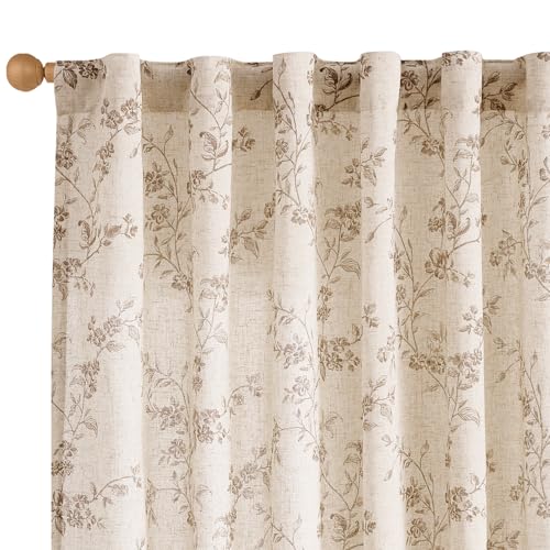
Textured fabrics such as linen or silk elevate the overall aesthetic. They interplay well, enhancing the tactile quality of the space.
For a less conventional approach, metallic or patterned options can add a touch of sophistication and interest. Opt for subtle patterns that won’t overwhelm the eye.
- Assess natural light: Lighter options work best in dark, compact spaces.
- Reflect on the overall theme: Consistency in style enhances visual harmony.
- Experiment: Test swatches beforehand to see how they interact with surrounding elements.
Selecting the right textiles can transform a room. It’s all about finding the perfect balance to complement and elevate the existing darker pieces.
Choosing Neutral Shades for Balance
Opt for shades like beige, taupe, or soft gray to create a harmonious look. These tones provide a subtle backdrop that allows the darker pieces to stand out without overwhelming the space.
Beige blends seamlessly with darker elements, softening the overall appearance while maintaining sophistication. Taupe introduces warmth, balancing the starkness of deeper hues, fostering a cozy atmosphere. Soft gray serves as a versatile option, effectively bridging gaps between lighter and darker elements.
Incorporating textures like linen or sheer fabrics will enhance these neutral shades, offering a dynamic layer that enriches the aesthetic. This approach not only adds depth but also invites light in, making the area feel more inviting.
Consider accents in the same neutral palette, such as decorative pillows or throws, to unify the design scheme. This method allows for a cohesive flow that enhances the elegance of darker furnishings.
Ultimately, sticking to neutrals can elevate the entire setting, striking a perfect balance that highlights both the bold and subtle aspects of your decor.
Incorporating Bold Colors for Contrast
To create a striking visual effect, I recommend incorporating deep hues alongside dark furnishings. Rich shades like royal blue, emerald green, or even a deep burgundy add drama and depth to the space. These tones generate a dynamic interplay, establishing a sense of sophistication.
Choosing the Right Pairings
- Royal Blue: This shade offers a regal appearance, especially when combined with metallic accents.
- Emerald Green: A jewel tone that brings a natural feel, it works beautifully in rustic or modern settings.
- Burgundy: A warm option that creates an inviting atmosphere, perfect for cozy spaces.
These bold options will stand out against darker pieces, providing an eye-catching contrast that draws attention. Consider introducing patterns through these rich tones, such as geometric designs or florals, to enhance visual interest.
Accenting with Textures
Integrating different textures amplifies the impact of vivid shades. I suggest combining smooth fabrics with textured materials like velvet or linen. This technique not only enriches the aesthetic appeal but also promotes a tactile experience.
Experimenting with bold colors can completely transform a room, making it a personal haven that reflects style and character.
Using Patterns to Add Visual Interest
Incorporating geometric designs can create striking focal points. Opt for bold shapes or intricate motifs that stand out without overwhelming the space.
Stripes are timeless and versatile; they can elongate a room or add depth. Thin lines lend a sophisticated edge, while thick ones make a statement.
Nature-inspired prints, like floral or botanical designs, can soften the look. Choose large-scale patterns for a dramatic effect, or smaller ones for a subtler touch.
Textured fabrics enhance visual appeal. Consider designs like damask or brocade; these add dimension and interest while maintaining elegance.
Using a mix of patterns requires balance. Pair a bold print with a more understated design to maintain harmony in the room.
Remember scale and proportion. Larger patterns can dominate in spacious areas, while smaller designs work best in compact settings.
Experimenting with contrasting patterns can result in a dynamic ensemble. Layer different textures and styles to create a curated look that reflects personal taste and style.
Exploring Textures to Enhance Aesthetics
Incorporating varied textures significantly elevates the visual appeal of a space. I found that soft fabrics, such as linen or velvet, create a warm and inviting atmosphere while complementing darker pieces significantly. For instance, sheer materials allow light to filter gently, providing a sense of openness without overwhelming the surroundings.
An interesting approach is mixing different textures within the same color palette. Combining plush textures, like a heavily woven fabric, with smoother surfaces can create depth and inviting contrasts. For example, pairing a rugged cotton weave with a sleek satin finish offers a tangible richness to the decor.
Additionally, natural elements play a crucial role in adding dimension. Incorporating materials such as jute, leather, or wood enhances the organic feel of a room. For instance, a jute rug underfoot can break the starkness of darker surfaces, creating a harmonious yet dynamic ambiance.
Lastly, consider layering textures for a more complex and stylish appearance. This technique involves combining diverse materials, like mixing a chunky knit throw over smooth seating arrangements. This interplay of textures invites touch and interaction, making the environment feel more lived-in and cozy.
Considering Lighting to Affect Color Perception
Choosing fabrics made from lighter materials can significantly influence how shades appear in various lighting conditions. For rooms filled with natural sunlight, softer tones tend to harmonize beautifully, while darker shades might absorb light and feel more intense.
In spaces illuminated by warmer artificial light, opt for hues that lean toward earthy or warm tones, as they can enrich the overall ambiance. On the contrary, cooler artificial lighting can make warmer tones appear dull; in such cases, selecting fresh, cool shades can enhance the vibrancy of a room.
It’s wise to test different materials under different light sources before making a final decision. Viewing swatches at different times of the day may reveal shifts in perception, guiding you to an optimal choice that resonates well with existing décor.
Consider using a light meter or even a simple smartphone app to gauge how light interacts within your space. This can inform your fabric decisions more accurately, ensuring that the selected textiles align seamlessly with both lighting and surrounding elements.
Pay attention to how various lighting fixtures–like table lamps or overhead lights–can alter the appearance of your chosen materials. For example, warm-toned bulbs often create a cozy, inviting feel, while brighter, cooler lighting can help showcase intricate patterns and textures.
Always keep in mind the room’s function; a bedroom may benefit from soft, calming shades that work well under low-light conditions, while a home office may require brighter tones to promote alertness during the day.
Matching Curtains with Room Themes
For a cohesive design, I prioritize the overall theme of the space. If the ambiance is modern and minimalistic, selecting sheer neutrals or monochromatic shades works beautifully, enhancing the clean lines of the environment while keeping light flow balanced.
Rustic and Farmhouse Themes
In a rustic or farmhouse setting, I often choose textured fabrics like linen or cotton in earthy tones or muted pastels. These materials resonate with the warmth of the wood and create a harmonious balance against the darker elements.
Industrial Styles
For an industrial theme, I lean towards heavier fabrics in deeper hues or bold patterns. Choices such as charcoal or rich jewel tones add sophistication, seamlessly integrating with metal and concrete accents, while still allowing the essence of the raw aesthetic to shine through.
Every space is unique; I find the best results come from considering how each element interacts within the room’s theme and character.
Practical Tips for Curtain Fabric Selection
Opt for lightweight materials like linen or cotton for a breezy feel, ensuring the space remains open and airy. These fabrics allow natural light to filter through while providing privacy.
Consider Weight and Fall
Heavier options, such as velvet or brocade, add sophistication and warmth, making them ideal for colder climates. Ensure these choices have a good drape to enhance their luxurious effect.
Maintenance and Durability
Select fabrics that are easy to clean and resistant to fading. Polyester blends or treated cotton hold up well against sunlight, ensuring longevity in vibrant tones or intricate patterns.
| Fabric | Light Filter | Texture | Care Requirements |
|---|---|---|---|
| Linen | Good | Natural feel | Dry clean recommended |
| Cotton | Moderate | Soft and breathable | Machine washable |
| Velvet | Poor | Rich and thick | Spot clean only |
| Polyester Blend | Good | Durable and smooth | Machine washable |
Choosing the right texture contributes significantly to the overall aesthetic. Incorporating layers, such as sheer underlayment with heavier top fabrics, adds depth.
Finally, take into account how each fabric interacts with the room’s lighting to enhance the chosen scheme. Test samples by hanging them in the actual space to observe shifts in appearance throughout the day.