


Begin by identifying the undertones present in your existing items. For instance, a warm amber finish can create a stunning contrast against cooler browns or grays. Use a color wheel to find hues that sit opposite each other for striking combinations.
Next, take into account the grain patterns of your selected materials. A pronounced grain can compete with color variation, so opt for solid shades that enhance the natural beauty without overwhelming it. Soft creams or muted earth tones often harmonize wonderfully with bolder pieces.


Consider lighting conditions as well; natural light can alter perceptions of hue. Test your selected options in different lights to understand how they interact throughout the day. Swatches can be a helpful tool in determining which shades resonate best with your overall aesthetic.

Finally, unify the space by incorporating accent decor that echoes your color scheme. Accessories like cushions, rugs, or artwork can provide additional layers without clashing with the main pieces. This strategic approach not only ties the room together but creates a sense of cohesion and balance.
Choosing Harmonious Shades for Your Wooden Pieces
I prioritize finding complementary tones within a similar color family. For instance, pairing lighter shades with darker ones can create balance while avoiding stark contrasts. Consider options like oak with walnut; the soft grain of oak contrasts beautifully against the rich, deep hues of walnut without clashing.
Textures and Finishes
I analyze the textures and finishes of each item. A polished surface can shine alongside rustic, matte pieces, allowing each to enhance the other’s beauty. Mixing different finishes–such as glossy with satin–can add depth and interest to the overall arrangement, creating a cohesive yet dynamic aesthetic.
Accessorizing for Visual Appeal
<p Incorporating textiles or accessories in neutral or coordinating colors can tie different wooden pieces together seamlessly. Soft cushions or throw blankets can introduce additional colors that complement the timber tones, allowing for an inviting atmosphere while maintaining harmony within the space.
Understanding Wood Color Undertones
To achieve harmony in your selections, first identify the undertones present in the timber. Common undertones include yellow, red, blue, and green. Each piece may exhibit subtle shades that can significantly influence the overall aesthetic.
Identifying Undertones
- Yellow Undertones: Often seen in oak and pine, these bring warmth. Pair with other warm tones like cherry or walnut.
- Red Undertones: Predominantly found in mahogany and cherry, these shades add richness. Complement with other deep, warm-hued varieties.
- Blue Undertones: Less common but present in some exotic species like eucalyptus. Pair with cool neutrals to enhance their depth.
- Green Undertones: Often associated with fir and cedar. These work well with earthy tones and muted palettes.
Practical Tips for Selection
- Use a natural light source while assessing undertones to accurately perceive their behavior.
- Sample multiple pieces within a space to see how they interact, especially under different lighting conditions.
- Compare hues against a color wheel to locate compatible counterparts within the furniture spectrum.
By understanding these subtleties, you can create a cohesive and welcoming ambiance that reflects your personal style.
Identifying the Main Types of Wood Finishes
Choosing the right finish for your timber pieces is key to achieving the desired look and durability. Here’s a simplified guide to the primary types of finishes you can consider.
1. Lacquer: A fast-drying finish that provides a durable, glossy surface. It’s often preferred for its quick application and strong resistance to moisture and chemicals. Regular maintenance is essential to keep its shine.
2. Varnish: This finish creates a hard protective layer and is suitable for indoor and outdoor applications. Available in different sheen levels, varnish is less prone to yellowing over time compared to other finishes.
3. Oil: Natural oils, such as tung or linseed, penetrate deeply into the grain, nourishing the material while enhancing its natural appearance. However, they require regular reapplication to maintain protection.
4. Shellac: Derived from the secretion of the lac bug, this finish gives an attractive, warm glow. It’s easy to apply and repair but is less water-resistant than other options, making it ideal for low-wear surfaces.
5. Polyurethane: Available in both oil-based and water-based formulations, this finish offers robust protection and durability. The oil-based version provides a warm tone, while the water-based variant dries clear, preserving the wood’s natural color.
Selecting the appropriate finish can enhance the aesthetic appeal and longevity of your timber pieces. Understanding these distinct options will help in making an informed choice that aligns with your style and maintenance preferences.
Creating a Color Palette for Your Space
Begin with a dominant shade that resonates with your personal style. This could be inspired by a particular piece of art or a striking decorative element. Once established, introduce complementary tones to enhance the overall ambiance. Choose a lighter hue for the walls to offer contrast, allowing the dominant color to shine.
Selecting Accent Shades
Incorporate one to two accent shades to elevate the space. These can be bolder colors that may appear in smaller accessories, such as cushions or artwork. Ensure these accents connect with the primary tone, creating a cohesive look. For instance, if your dominant color is deep blue, consider accents in vibrant coral or mustard.
Maintaining Balance
Avoid overwhelming the environment by keeping a balance between light and rich colors. If you opt for darker elements, ensure that ample natural or artificial light fills the room. Additionally, integrating textures, like woven fabrics or metallic surfaces, can further enhance visual interest without complicating the palette.
By thoughtfully selecting and coordinating these shades, a harmonious and inviting atmosphere can emerge, tailored to reflect your unique preferences.
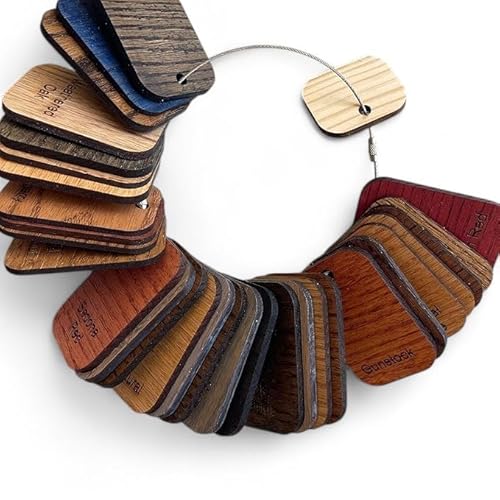
Comparing Different Wood Samples in Natural Light
To accurately assess various samples, position them near a window with ample daylight. Natural lighting reveals the true hues and undertones of the samples, enabling a clearer comparison.
Place multiple pieces adjacent to one another to observe subtle differences. Pay attention to how ambient light interacts with each surface: some may appear warmer or cooler based on the time of day and the angle of sunlight.
Here’s a simple table to guide your observation:
| Sample Type | Color Observation in Natural Light | Undertone Identification |
|---|---|---|
| Oak | Light to medium brown with golden highlights | Yellow undertones |
| Cherry | Rich reddish-brown that deepens with exposure | Red undertones |
| Walnut | Dark brown with purple and grey hints | Purple undertones |
| Maple | Clear, light tone often appearing creamy | Neutral undertones |
Regularly step back to review the samples from different viewpoints, as this also influences perception. Adjusting the positioning based on how the sun moves throughout the day can further enhance your evaluation process.
A helpful tip: create a visual reference by photographing the samples under the same lighting conditions, ensuring you refer back as needed during your selection process.
Using Color Wheel Principles for Furniture Coordination
To create harmonious arrangements within a space, I often rely on the fundamentals of the color wheel. Start with a basic understanding of complementary and analogous hues. For instance, pairing warm finishes like mahogany with cooler shades such as ash can add a dynamic contrast that is visually appealing.
Identifying undertones is another critical aspect. A piece with a subtle yellow undertone can look stunning alongside deeper purples and blues, which neutralize the warmth. This contrast creates depth and richness, enhancing each surface’s character.
Experimenting with triadic schemes can also be rewarding. For example, combining three equidistant colors from the wheel ensures balance and interest. Selecting a light oak, medium walnut, and a dark cherry can yield a layered look that feels cohesive while still playful.
Lastly, consider the impact of the environment. Testing samples under different lighting conditions can reveal how finishes interact with each other and the surrounding elements. This practice will help me visualize the overall effect before making final decisions.
Incorporating Textures and Patterns in Design
To achieve depth in your space, consider layering various textures alongside your selected tones. For instance, combining a smooth finish with a rough-hewn surface adds dimension and interest. A soft, plush fabric can offset the hard edges of a polished piece, balancing the visual dynamics.
Choosing Complementary Textures
When selecting textiles, opt for those that resonate with the tactile qualities of your chosen items. A woven throw can harmonize beautifully with a sleek table, while a carved accent piece stands out against a plain backdrop. This approach cultivates a curated look without overwhelming the senses.
Utilizing Patterns for Contrast
Incorporate patterns strategically. Geometric designs on cushions or drapery can create a striking contrast to the natural grain of your surfaces, drawing attention to both elements. Layering patterns–such as stripes with florals–can add a playful vibe, yet maintaining a coherent palette is essential for cohesion.
Experiment with scale; larger patterns may dominate a space, while smaller designs can complement it. Always test combinations in the intended environment, as lighting can dramatically affect how textures and patterns interact with one another.
Choosing Complementary Hues for Accessories
Opt for accent shades that resonate with your chosen pieces. For instance, if the primary items have warm undertones, consider adding accents in earthy colors or muted pastels. Deep greens or terracotta can create a sophisticated ambiance.
Textures and Materials
Incorporating varied materials can enhance visual interest. Pairing natural fibers like linen or cotton with ceramics can complement warm elements beautifully. Alternatively, for cooler wooden tones, metals like brass or steel can introduce a contemporary touch while maintaining harmony.
Accent Pieces
Utilize decorative items like pillows, vases, or artwork to bring cohesion to the setting. Choose patterns that echo the grains and finishes of major pieces. Geometric designs can add a modern flair, while botanical prints tie in organic elements seamlessly.
By carefully selecting these complementary hues and materials, I find it easier to craft a cohesive environment that feels both intentional and inviting.
Avoiding Common Mistakes in Color Matching
Focusing on the undertones is critical. Often, people overlook the subtleties in shades and select pieces based solely on surface appearance. It’s essential to examine how the hues interact under different lighting conditions; what looks appealing in a store may appear entirely different in your home.
Key Oversights to Avoid
- Neglecting Natural Light: Test samples in the natural light of the room where they will reside. This exposure reveals true tones.
- Ignoring Surrounding Elements: Always consider wall colors, flooring, and other decorative items to ensure cohesive aesthetics.
- Rushing Decisions: Take your time when selecting shades. Live with swatches for a few days to see how they feel at various times of day.
- Disregarding Finish Types: Different finishes can alter the perceived color. Glossy surfaces reflect light differently than matte finishes.
- Overlooking Scale: Large pieces can dominate a space and impact how colors are perceived. Balance larger items with complementary smaller accents.
Practical Tips for Success
- Gather a variety of samples. Include various species and finishes to compare side by side.
- Utilize color strips from paint stores to create a palette that coordinates with your chosen items.
- Incorporate textures creatively. Textural elements can enhance visual interest and tie different shades together.
- Seek feedback from others. A fresh perspective can reveal biases you might not notice.
By staying mindful of these common pitfalls, I’ve managed to create harmonious and inviting spaces that reflect my style and taste.


