If you’re looking to revitalize your space, selecting the perfect shade for your pieces is crucial. Start by taking into account the surrounding environment. Observe the existing palette in your room; incorporate complementary or contrasting tones to create a cohesive aesthetic. For instance, earthy tones pair beautifully with natural light woods, enhancing the overall ambiance.
Expanding on your preferred style can provide more direction. Opt for light pastels for a contemporary vibe, while rich, dark hues may evoke a sense of elegance and drama. Test samples directly onto the surfaces of your items to see how they interact with different lighting throughout the day. This step is often overlooked but can be the difference between satisfaction and regret.
Finally, don’t shy away from exploring trends and timeless classics. Incorporating these elements can add depth to your selections. Combining modern shades with traditional finishes often results in a unique look tailored to your taste. Remember that the goal is not just to transform the surface but to enhance the entire mood of your space.
Making an Informed Selection for Furniture Coatings
I recommend assessing the existing decor and the intended atmosphere of the space. Analyze the hues and patterns in nearby walls, textiles, and accessories. Choosing tones that complement or contrast can create a harmonious effect. For a modern vibe, opt for muted shades, while bright and bold options may energize a room.
Testing Samples Before Finalizing
Before committing, apply samples directly on the furniture surfaces. Observe how the lighting affects the appearance over different times of the day. This method reveals undertones that might not be apparent in store displays. Let the samples dry completely, as this can alter the final look significantly.
Balancing Warm and Cool Tones
Evaluate your preference for warm or cool tones. Warm shades, like reds and yellows, tend to create a cozy atmosphere, while cool shades, such as blues and greens, impart serenity. Striking a balance based on furniture function and surrounding decor can enhance the overall design consistency.
Assessing the Existing Color Palette in Your Space
Identify all existing shades within the room to create harmony. Focus on wall hues, flooring, and any permanent fixtures that contribute to the visual environment.
To begin, take note of the dominant tones in the area:
- Analyze the walls’ finish and texture.
- Observe any large pieces like rugs or curtains.
- Consider the impact of natural light throughout the day.
Next, create a mood board featuring swatches that resonate with the existing schemes. This will help visualize how new tones will interact with the current setting.
Engage family members or friends for feedback on your choices. Their perspectives might reveal interactions you haven’t considered.
Pay attention to complementary versus contrasting relationships. Aim for shades that will either complement existing elements or provide a bold contrast, enhancing the overall aesthetic.
Finally, test samples in your space before finalizing decisions. Observe how the colors change under different lighting conditions at various times of the day. This approach ensures that the selected hues will maintain their desired impact, creating a cohesive and inviting ambiance.
Determining the Mood You Want to Create
I recommend defining the atmosphere you wish to achieve before selecting shades for your pieces. To evoke serenity, consider soft pastel hues or muted tones. For a lively space, bold primary shades or unexpected combinations can energize the surroundings.
Identify key emotions linked with various palettes. Blues and greens typically promote calmness, while reds and oranges ignite passion and warmth. Utilize color psychology to influence how you want the room to feel. For instance, earthy tones may evoke comfort, making a space feel cozy and inviting.
Setting the Scene
Think about the primary purpose of the area. A workspace may benefit from cooler shades, enhancing focus. Conversely, a living area might thrive with warmer tones that invite relaxation and social interaction. Assessing the functionality first aids in aligning color schemes with desired outcomes.
Incorporating Personal Style
Your preferences are crucial. Reflect on colors that genuinely resonate with you and match your personality. Combine your style with the intended mood to craft an appealing environment. Utilize sample swatches–visualizing them in the existing light will help finalize choices that suit both mood and aesthetic dimensions.
Exploring Color Theory Basics for Furniture Design
Understanding the fundamentals of color theory can significantly enhance the aesthetic appeal of your décor. Start by familiarizing yourself with the color wheel. Primary shades–red, yellow, and blue–serve as the cornerstone for mixing secondary hues, which include green, orange, and purple. This foundational knowledge allows you to experiment and create harmonious pairings.
Complementary and Analogous Schemes
Utilizing complementary shades, which sit opposite each other on the color wheel, can create striking contrasts. For instance, pairing a deep blue with a warm orange draws the eye and generates visual interest. Alternatively, consider analogous combinations, where colors adjacent to one another–such as blue, teal, and green–produce a serene and cohesive look. This method is efficient for achieving a sophisticated atmosphere, especially in open spaces.
Warm vs. Cool Shades
Assess the warmth or coolness of your selections. Warm tones like reds and yellows evoke energy and comfort, suitable for social areas. Cool tones, including blues and greens, foster calmness and tranquility, making them ideal for bedrooms or offices. Reflect on the purpose of each space to guide your choices accordingly, ensuring the ambiance aligns with the desired emotional response.
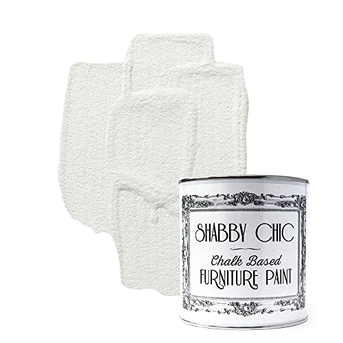
Testing Paint Samples on Your Furniture
I recommend applying samples directly onto the surface you plan to revamp. This allows for an accurate understanding of how the hue interacts with the existing environment. Select small sections of the piece to avoid overwhelming visual impact. Use a bold brush or foam applicator to cover the areas evenly.
Before starting, ensure the surface is clean and smooth. For optimal results, I sand the area lightly and wipe it down. This preparation enhances adhesion and the final appearance. Apply at least two coats of each selected shade for a true representation, as some finishes might appear different in one layer versus multiple applications.
Consider lighting conditions during the testing. Natural light showcases nuances differently than artificial sources, so assess the results under various lighting at different times of the day. If possible, examine the samples in the room where the item will remain to see how it interacts with the surroundings.
Use the following table to track your impressions of each sample tested:
| Sample | Lighting Condition | Notes |
|---|---|---|
| Sample 1 | Natural Light | Bright and cheerful, matches wall color. |
| Sample 2 | Warm Artificial Light | Rich and cozy, slightly darker. |
| Sample 3 | Cool Artificial Light | Looks dull, needs more vibrancy. |
Taking notes helps clarify your thoughts and feelings about each option. After a few days, revisit each sample to see if your preferences remain consistent. This will inform your final decision, ensuring satisfaction with the outcome.
Considering Finishes and Sheens for Optimal Appearance
Selection of the right finish significantly impacts the overall look of painted surfaces. A glossy sheen enhances the vibrancy, making hues appear more intense, while a matte finish offers a subtle elegance, softening colors and textures. When assessing options, consider how the finish interacts with light. Glossy coatings reflect light, creating a brighter effect; this can be ideal for smaller spaces lacking natural light. Conversely, matte finishes absorb light, which can lend an intimate, cozy feeling to larger areas.
Exploring Different Sheens
Understanding the range of finishes available is crucial. Satin provides a soft sheen that balances durability and aesthetic appeal, making it suitable for high-traffic items. Semi-gloss is perfect for accent pieces, offering a sophisticated shine that’s easy to clean while still being understated. For a contemporary look, high-gloss finishes can transform ordinary structures into striking statements, emphasizing unique features. However, be mindful that imperfections may become more pronounced on shiny surfaces.
Durability and Maintenance Considerations
Durability varies with each sheen. Glossy finishes tend to be more resistant to wear and tear, making them ideal for surfaces that endure regular use. However, they may require more frequent cleaning due to visible dust and fingerprints. Matte finishes, while elegant, may necessitate more careful maintenance as they can scuff easily. I often recommend testing how different sheens hold up against daily activities to better understand their practical implications, especially for pieces in busy areas of a home.
Staying Updated with Current Color Trends
To remain in tune with contemporary hues, I frequently explore design magazines and follow influential interior decorators on social platforms. Their insights often highlight emerging shades and combinations that resonate with current tastes.
Utilizing trend forecasting websites also provides valuable foresight on anticipated palettes. These platforms analyze data, consumer interest, and cultural phenomena to suggest what might become fashionable in the near future.
Another strategy that has proven beneficial involves attending local and national design expos. Here, I observe demonstrations and installations showcasing innovative uses of tones, allowing me to gather practical ideas and inspiration.
Connecting with local paint suppliers can be beneficial as well; their knowledge of new products and limited editions can inform my decisions. Engaging with workshops also enhances my understanding of what’s trending.
Using digital tools like color matching apps, I find it easier to visualize trendy shades in specific environments, ensuring that my selections are aligned with modern aesthetics.
Lastly, maintaining an open dialogue with friends or fellow enthusiasts offers additional perspectives on popular shades, enabling me to incorporate fresh ideas into my projects.