


If you have chosen rich, deep-toned materials for your space, consider pairing them with light, neutral shades such as soft beige or creamy whites. These hues create a striking contrast that highlights the elegance of your chosen pieces while promoting a sense of openness and calm.
For a more dynamic look, incorporating earthy tones like olive greens or muted terracottas can enhance the warm undertones of your deep shades. These choices foster a connection to nature and can create a cozy yet sophisticated atmosphere. Implementing accent details, such as throw pillows or wall art in these colors, can effectively tie the room together.
If you prefer a bold statement, jewel tones like emerald or sapphire can serve as an excellent counterpart. These rich and luxurious shades add depth while complementing the inherent beauty of your selections. When used in moderation–through decor or textiles–they can elevate the overall aesthetic of your space.

Finally, consider introducing metallic accents, such as gold or bronze. These finishes add an element of glamour and warmth, perfectly harmonizing with darker shades. Subtle touches in lighting fixtures or decorative items can enhance the overall elegance, creating a refined, inviting environment.


Choosing Hues to Complement Rich Timber Accents
I recommend opting for soft neutrals like beige or taupe, which create a soothing contrast to rich timber tones. Shades of cream can also introduce warmth while maintaining an airy feel.
Add depth with deep blues or navy. These tones not only highlight the elegance of timber but also impart a sense of serenity to the space.
Consider muted greens, especially sage or olive. These provide an organic touch, harmonizing beautifully with natural grains.
For a bolder option, terracotta or burnt orange can add a striking element, energizing the room while still respecting the warmth of the timber.
Introduce accents with gold or brass for a touch of luxury. These metallics can enhance the richness of the darker shades, giving a sophisticated vibe.
Textures matter too. Incorporating fabrics like linen or soft cotton in these suggested shades will elevate the overall aesthetic further.
Choosing a Color Palette for a Cozy Atmosphere
Opt for warm neutrals and soft pastels, creating a welcoming ambiance in your space. Taupe, cream, and light beige harmonize beautifully, enhancing the richness of your furniture’s hue. Pair these shades with accents like dusty pink or muted sage for added depth.
Accent Colors
- Soft blush: Adds a gentle touch and enhances comfort.
- Muted teal: Introduces a calming vibe without overpowering the setting.
- Warm mustard: Provides a cheerful contrast, perfect for decorative elements.
Textures and Patterns
Incorporate textured fabrics to introduce visual interest. Velvet cushions in soft neutrals or earthy tones can soften the overall look. Geometric or botanical prints on curtains or throws can complement the natural history of the material.
Lighting plays an essential role too. Choose warm white or soft yellow bulbs to illuminate the space, ensuring everything feels cozy and inviting.
Complementary Colors That Enhance Dark Wood Tones
Deep emerald green pairs beautifully, bringing a touch of sophistication. I often use this hue in accessories or accent walls to create a luxurious feel without overpowering the existing elements. Soft blues, like sky blue or powder blue, introduce a serene ambiance, perfect for promoting relaxation in a space meant for rest. Using these shades as bedding or curtains makes a significant impact.
Warm Neutrals
Warm neutrals such as taupe and soft beige complement the intensity of rich timber. These shades can serve as a backdrop–ideal for larger areas like walls or rugs. Incorporating creamy whites or light grays can brighten the room, providing a fresh contrast and making the space more inviting.
Bold Accents
For those who prefer a pop of color, consider burnt orange or mustard yellow. These tones contrast nicely, adding energy while remaining stylish. Utilize these shades in decorative pillows or art pieces to accentuate the room’s character without overwhelming the space.
Using Neutrals to Balance Dark Wood Furniture
For a harmonious environment, I recommend integrating soft, neutral shades such as beige, taupe, or light gray. These tones effectively counterbalance the richness of darker surfaces, creating an inviting atmosphere. I find that incorporating these hues through wall paint, bedding, or accessories can instantly brighten the space while allowing the beauty of the furniture to shine.
Textiles and Accessories
Selecting cushions, rugs, and curtains in these subdued shades further enhances the overall aesthetic. Fabrics like linen and cotton in beige or cream add texture and warmth, softening the starkness of richer elements.
Accent Elements
<p I prefer to introduce elements such as white or off-white accents, which can be included in decorative pieces or lighting fixtures. This approach draws the eye upwards and balances the room, ensuring that no single aspect overwhelms the design. Integrating a mix of these tones truly creates a cohesive and serene ambiance.
Accent Colors That Add Vibrancy to the Space
To enhance the ambiance, I recommend incorporating shades of teal and turquoise. These energetic hues create a striking contrast against the deep tones of timber while infusing a refreshing element into the area. Accents can be applied through cushions, throws, or artwork.
Warm Hues for a Cozy Vibe
Implementing rich tones such as mustard yellow or burnt orange can foster a warm and inviting atmosphere. These lively shades offer a delightful pop against the natural elements, ensuring a chic yet comfortable environment.
Subtle Yet Impactful Touches
- Peach: Adds a soft warmth that balances darker elements without overwhelming the senses.
- Cerulean Blue: Provides a cool, serene touch, complementing deeper shades effectively.
- Rose: Introduces a delicate vibrancy that brings life to the overall aesthetic.
Using these accent shades strategically throughout the space can create a harmonious blend of warmth and energy, making the area feel more dynamic and engaging.
Creating Contrast: Light Shades Against Dark Timber
Opting for soft pastels such as light blue or mint green creates a pleasing contrast that brightens the space while allowing the rich tones of the timber to stand out. Shades like off-white and pale beige can also be incorporated to reflect light effectively, enhancing the overall ambiance.

Incorporating Textures
Textures play a significant role in adding depth. Pair lightweight fabrics, like sheer curtains in soft cream, with cozy throws or pillows in light hues. This combination not only softens the appearance of high-contrast pairings but also introduces warmth.
Strategic Placement of Accessories
Utilize accessories like artwork and decorative items in lighter shades to pull the eye around the room. A gallery wall featuring pastel frames can create visual interest and balance. Introduce greenery through light pots to enhance the inviting feel while linking the aesthetic of nature with the sturdy timber pieces.
Effective use of light shades and textures provides a perfect harmony with rich hues, resulting in a serene and inviting sanctuary. Experimenting with different elements will help achieve the ideal balance in your personal oasis.
Incorporating Textures and Patterns with Dark Wood
To enhance the aesthetics of rich, deep hues, I recommend using a mix of textures and patterns. This approach adds depth and interest to the space. Layering textiles like velvet, linen, or wool can create a cozy environment that contrasts nicely with shiny surfaces.
Incorporating geometric patterns through rugs or throw pillows introduces a modern touch. These patterns stand out beautifully against the backdrop of deeper shades, creating an engaging visual narrative.
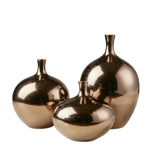
Using natural elements such as stone or clay adds an organic feel. For instance, a textured stone vase or ceramic lamp breaks the monotony and ties everything together harmoniously. Here’s a quick reference table to guide your selection of textures and patterns:
| Texture/Pattern | Suggested Material | Effect |
|---|---|---|
| Velvet | Cushions, Drapes | Adds luxury and warmth |
| Geometric | Rugs, Throws | Modern and dynamic |
| Natural Fibers | Baskets, Wall Hangings | Earthy and inviting |
| Striped | Bed Linens, Curtains | Creates visual height |
| Abstract | Art Pieces, Decor | Infuses creativity and intrigue |
Focusing on various textures and the right patterns will elevate a space, allowing it to feel fully realized and intentionally designed. This layered approach offers functionality along with style, resulting in a truly unique aesthetic experience.
Seasonal Color Ideas for a Fresh Look
For a refreshing update, I often find inspiration in the changing seasons. Each time of year brings unique shades that can transform a space. In spring, soft pastels like mint green and blush pink can infuse the room with a light, airy feel. Pairing these hues with light fabrics softens the overall atmosphere.
Summer Shades
During summer, I like to embrace lively tones. Bright yellows and aqua blue evoke a cheerful vibe, especially when paired with light linens. These lively hues create a striking contrast, making the ambiance feel vibrant.
Autumn and Winter Tones
As the leaves change, I lean towards warm earthy shades such as terracotta or mustard. These colors create a cozy environment, perfect for the colder months. For winter, deep shades like navy and rich burgundy add sophistication, providing a snug feeling ideal for hibernation.


