A well-curated palette can seamlessly bridge diverse pieces throughout a space. By selecting hues that appear across multiple surfaces, even the most eclectic items can feel as if they belong together. For example, if you have a vintage armchair and a modern coffee table, incorporating a shared tone, such as muted green or soft beige, in throw pillows or decorative accents can create a harmonious effect.
Consider balancing dominant and accent shades. If a bolder, darker tone is present in one element, complement it with lighter, softer hues elsewhere. This approach not only softens visual contrasts but also draws attention to key pieces, allowing them to shine within the assembly. I often find that bringing in textures through textiles can enhance this effect, making disparate elements feel united through shared warmth and texture.
Utilizing a consistent pattern across different furnishings can also enhance coherence. Stripes, florals, or geometric designs can pull disparate pieces together, especially when consistent shades are used within these patterns. I often look for patterns that incorporate base colors from the larger design scheme, ensuring that everything flows naturally and feels thoughtfully arranged.
Identifying a Color Palette that Works
To effectively unify diverse elements in your living space, I recommend starting with a base hue that resonates with at least one item in the room. This will create a visual anchor. From there, I usually select two to three complementary shades to enrich the theme.
Analyzing Existing Pieces
Take a close look at your current items and identify colors present in patterns or textures. For instance, if a chair has a muted blue tone, consider incorporating lighter or darker variations of that blue elsewhere. This creates cohesion without forcing all elements to match identically.
Experimenting with Neutrals
Integrating neutral tones can bridge gaps between contrasting pieces. I find that variations of gray, beige, or soft whites provide a soothing backdrop, allowing bolder shades to shine. Additionally, employing these neutral shades on larger surfaces, such as walls or rugs, can help balance out vivid accents.
Using Accent Colors to Bridge Styles
Choose a single accent hue that resonates with multiple pieces in your space. For instance, if you have a rustic wooden table and a sleek modern chair, an accent pillow or decorative item in a shade of deep blue can create a unifying element. This approach not only adds harmony but also provides visual interest.

Incorporate your chosen accent shade in various accessories such as vases, art frames, or throws. A cohesive presence of the accent in different materials and shapes will strengthen the overall aesthetic. Try placing a few items around the room; this repetition makes the accent appear intentional and thoughtful.
Utilize textiles to further enhance the effect. Selecting a patterned rug featuring your accent shade can subtly draw the eyes across different furnishings. This method encourages the viewer to appreciate the unique character of each piece while still feeling balanced.
Lighting plays a critical role as well. Consider using lampshades or light fixtures that feature your accent hue. The way light interacts with various textures can help unify disparate pieces even more, creating a cohesive atmosphere.
Don’t shy away from experimenting with a mix of finishes. Metallics, matte surfaces, and natural textures can all coexist beautifully when they share a common accent color, adding depth and subtle cohesion to the overall design.
Painting Walls for Cohesion
Choosing the right wall hue can significantly enhance the overall look of a space filled with varied pieces. A solid foundation in the form of wall paint creates a unified backdrop that anchors diverse elements.
Here are some steps that have worked for me:

- Opt for Neutral Tones: Shades like beige, gray, or soft white can act as a canvas that complements everything, letting individual pieces shine without overpowering one another.
- Incorporate a Base Color: Select a base hue from your existing decor. For instance, if there’s a prominent shade from a couch or artwork, reflecting that on the walls can enhance continuity in your space.
- Accent Walls: Creating an accent wall with a bolder shade can draw attention to a specific area while maintaining harmony. It’s a great way to make a statement without overwhelming the entire room.
- Test Samples: Before committing, apply samples on the walls. Viewing colors at different times of day under varying light can reveal how they interact with other shades in the room.
When considering textures, matte or eggshell finishes can soften transitions between different design elements, contributing to a more cohesive appearance. Glossy finishes might highlight flaws, which can detract from the aim of unity.
Always aim for balance. A well-chosen wall tint can unify an eclectic mix, making your room feel thoughtfully designed rather than chaotic.
Incorporating Textiles for Color Unity
Select textiles that reflect your chosen palette for a cohesive feel in your living space. Opt for items such as cushions, throws, and rugs that incorporate the same hues found in your eclectic pieces.
For example, if you have a vintage armchair with floral patterns, look for a throw that showcases a similar tone or pattern. This creates a visual link between disparate elements while adding comfort. Layering textures can also enhance the unity–consider mixing materials like cotton, linen, and wool.

When layering fabrics, keep the scale of patterns in mind. Large patterns should be balanced with smaller ones to avoid overwhelming the space. A well-placed geometric rug can ground a room featuring various seating options, while patterned cushions can echo the colors used in artwork or decor.
| Textile Type | Function |
|---|---|
| Cushions | Add comfort and visual interest. Select patterns that reference existing hues. |
| Throws | Provide warmth and texture. Look for coordinating colors and soft materials. |
| Rugs | Anchor the space. Choose one that harmonizes with your existing pieces through shape or design. |
| Curtains | Frame the room. They should bring together the palette without competing for attention. |
Experiment with layering textiles on surfaces, such as placing a bold-patterned throw over a neutral sofa. This adds an element of surprise while maintaining coherence. Rugs can also be used as a focal point–select one that highlights your palette and brings the room together.
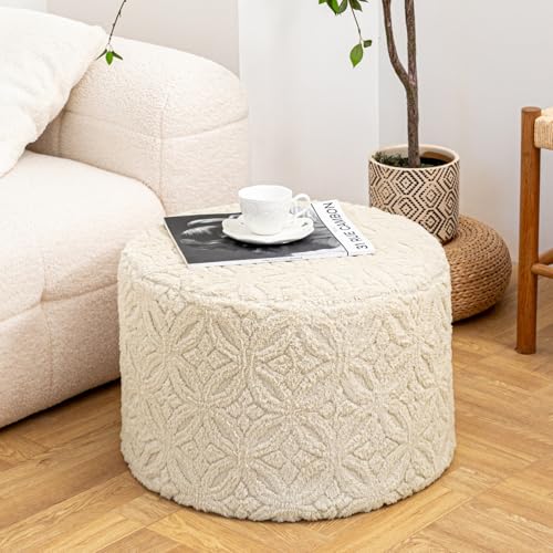
Finally, be adventurous with accents. Incorporate items like poufs, ottomans, or decorative pillows to inject new colors into the mix while maintaining a unifying thread. Each piece should express an element of the existing palette, allowing for a well-rounded and inviting space.
Selecting Decorative Accessories with a Common Hue
Choosing decorative items with a shared hue can unify disparate pieces in a room. Start with smaller accents like vases, picture frames, or throw pillows. For instance, selecting pillows in a shade present in both a rustic cabinet and a modern sofa can create visual harmony.
Consider materials and textures while picking accessories. For example, matte finishes can complement modern styles, while distressed wood or metals might resonate better with vintage pieces. Mixing these textures can enhance the immersion of shared tones.

Grouping Items for Visual Impact
When arranging accessories, group them in odd numbers. Three or five items, such as candles or small sculptures in the same color, create a focal point without overwhelming the space. Additionally, varying the heights and shapes can add dimension, making the collection more engaging.
Nature-Inspired Elements
Incorporating natural elements, such as plants or flowers in your chosen hue, brings a fresh touch to the décor. Opt for ceramic pots or woven baskets that echo other elements in the room, reinforcing the selected color scheme while introducing organic shapes and textures.
Creating a Focal Point with Color
Incorporating a bold hue as a focal point can effectively unify disparate decor elements. Select a prominent piece, like a vibrant sofa or an artwork, that embodies this chosen shade.

Position this centerpiece strategically within the room to draw the eye. For instance, if choosing a striking red chair, I might arrange it near neutral-toned pieces, allowing it to stand out. The contrast will create visual interest while still connecting the surrounding elements.
For a cohesive effect, consider using the same striking hue in smaller accents throughout the space. This could manifest in cushions, vases, or throws, reinforcing the central theme without overwhelming the room.
Utilizing lighting can enhance this focal area. A spotlight or a unique lamp can emphasize the piece, making it a true showstopper. This technique encourages the eye to move around the space while anchoring the various styles through a shared element.
Balancing Bold Hues in an Eclectic Mix
Choose a primary shade that can anchor the entire arrangement. This dominant hue should resonate with pieces across your space, creating a sense of unity without overwhelming the senses.
Considerations for Choosing Your Primary Shade
- Assess the predominant tones in your largest elements: walls, rugs, and larger items.
- Opt for a shade that enhances existing pieces rather than compete with them.
- Evaluate natural lighting; a bold tone may appear different throughout the day.
Incorporate secondary and tertiary shades that complement the main tone. This approach prevents a chaotic appearance, ensuring your setting feels harmonious and intentional.
Strategies for Secondary Shades
- Utilize accessories–like pillows or throws–in these hues to subtly weave them into the design.
- Introduce artworks or decorative pieces that incorporate your chosen palette, ensuring they don’t feel random.
- Balance brightness; if the primary shade is vivid, consider softer tones as accompaniments.
Evaluate patterns and textures. A mix of designs can help balance out more daring tones, providing visual relief and preventing the overall look from feeling too intense. Find a common thread, be it a shared color or complementary patterns, to create a cohesive narrative.