


Begin by selecting a base tone that acts as the foundation for your masterpiece. A muted gray or soft white provides an excellent canvas. Apply this base evenly to ensure a smooth texture, allowing it to dry completely before progressing.
Next, incorporate two or three accent shades that will shine through your design. Choose colors that contrast yet harmonize with the chosen base, such as earthy greens, rich blues, or warm ambers. Use a sponge or brush to dab these hues strategically, focusing on edges and corners for a rustic appearance.
After applying the second coat, take a small piece of sandpaper to lightly distress the raised areas. This step reveals the underlying color, creating an aged effect. Pay attention to the layering–worn edges bring out depth, enhancing the overall aesthetic.
Lastly, seal your work with a matte finish to protect the surface while maintaining the intimate charm of this unique coloration. Allow it to cure fully, revealing a stunning piece that marries tradition with your creative flair.
Achieving a Unique Multicolor Finish
Begin by selecting your palette. Choose two or three hues that complement each other. I often pick a base tone for the larger surfaces and contrasting shades for accents.


Layering Techniques
Apply the primary hue evenly across the whole surface. Allow it to dry completely. Then, focus on applying the secondary and tertiary tones strategically. Use a sponge or a brush for softer transitions. For sharper lines, tape can be very helpful, giving well-defined edges.
Weathering the Finish
Once the layers are dry, utilize sandpaper or a sanding block to wear down certain areas. Concentrate on edges and corners to create a naturally aged effect. If I want a more textured appearance, I sometimes use a damp cloth after sanding to create shadows where the layers meet.
Lastly, seal the project with a protective top coat that enhances durability while allowing the colors to shine through. A matte finish tends to work well for this style.
Selecting the Right Furniture for Distressing
Choose pieces made of solid wood or plywood rather than particle board for optimal results. These materials accept paint and techniques better, yielding more authentic textures and finishes.
Avoid intricate designs or overly polished surfaces; simpler forms lend themselves well to alterations. Look for items that naturally show wear or have a rustic aesthetic, as this characteristic can enhance the layered color application.
Keep the dimensions in mind. Smaller items, such as side tables or chairs, allow for easier handling and experimentation, making them perfect candidates for your creative process.
Test on scrap wood or an inconspicuous area first to gauge how surfaces react to the chosen techniques. This step ensures the final appearance aligns with your envisioned outcome.
Lastly, consider the functionality of the piece. Select items that will be used frequently or as statement decor then, imparting not only beauty but also practicality during this transformation.
Choosing Color Combinations that Complement Each Other
Selecting harmonizing shades is the foundation of a successful project. Begin by analyzing the color wheel; adjacent hues typically work well together. For instance, pairing teal with blue or peach with coral can create a soothing aesthetic.
Analyzing Contrast for Depth
Incorporating contrasting tones adds dimension. Use dark and light variations of the same color for an eye-catching effect. Dark grey and soft white can create a striking finish. Consider using warm and cool contrasts, like mustard yellow and deep navy, to bring energy into the space.
Choosing Neutrals as a Base
Neutrals are versatile and serve as a perfect base. Select shades like beige, grey, or cream to allow the brighter colors to stand out more effectively. Once a neutral foundation is laid, you can layer in bolder hues, ensuring they don’t overwhelm the overall look.
- Use two or three main shades to maintain balance.
- Test combinations on a small area or samples before full application.
- Incorporate natural elements, such as wood tones, to ground your scheme.
Consider the surrounding decor when finalizing color choices. It’s beneficial to keep existing styles or themes in mind for cohesive integration.
Preparing the Surface for Distressing Techniques
I recommend thoroughly cleaning the piece before applying any techniques. Use a mixture of warm water and mild soap to wipe down the surface, removing dust, grease, and any old polish. Allow it to dry completely, as moisture can interfere with paint adhesion.
If the original finish is glossy, lightly sand the surface using fine-grit sandpaper. This promotes better paint adherence and prepares the wood for additional treatments. Make sure to follow the wood grain to avoid unsightly scratches.
For older or damaged items, fill in any cracks or holes with wood filler. Once the filler is dry, sand smooth until it’s flush with the surrounding area. This step is crucial for achieving a flawless finish.
A primer can be useful, especially on surfaces that are stained or marked. It not only helps the paint adhere better but also prevents bleed-through of stains that can occur with vibrant hues.
Finally, consider applying a barrier coat of a clear sealant if you’re working with a particularly porous material. This final preparation step can ensure that the subsequent coats of paint go on evenly and can be manipulated easily during the embellishment process.
Applying Base Coats: Step-by-Step Guide
To achieve a sturdy foundation for the look I desire, I begin by applying a base layer. Here’s my approach:
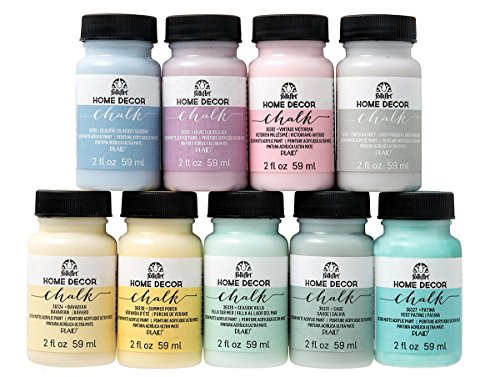
- Gather materials: I ensure I have quality acrylic or chalk paint, a paintbrush or foam roller, and a suitable primer if needed.
- Choose a color: Selecting a base shade is vital. I typically prefer a neutral tone, like white or beige, to allow other hues to pop.
- Surface preparation: I clean the piece thoroughly, removing any dust or grease. If the wood is glossy, a light sanding helps the paint adhere better.
- Apply primer: If I’m working on a porous surface or a darker piece, I use a good primer to ensure a uniform finish. I let it dry completely.
- Paint the base coat: Using a brush or roller, I apply the first coat of paint evenly across the surface. I pay attention to corners and edges.
- Drying time: Allowing sufficient drying time is crucial. I typically wait at least a few hours or overnight if the humidity is high.
- Second coat: Once dry, I assess the coverage. If necessary, I apply a second coat for a more opaque finish, repeating the drying process.
Following these steps sets the stage for adding further layers, enabling a beautiful transformation as I build complexity with each new hue.
Techniques for Creating a Distressed Look
I recommend utilizing sanding techniques to create an aged appearance. By gently sanding areas where natural wear would occur, such as edges and corners, I expose the underlying layers for a more authentic feel.
Layering paints is another effective method. Begin with a base coat, let it dry, then apply a contrasting color. Once fully dried, I lightly sand specific areas to reveal the base underneath, adding depth to the final effect.
A sponge technique can introduce a textured look. Using a damp sponge and a lighter shade, I dab on the surface after the primary color dries. This adds subtle highlights, enhancing the aged finish.
Applying wax or glaze is also beneficial. After achieving the desired colors, I use a clear wax or tinted glaze to accentuate details. This not only adds shine but also aids in protecting the surface.
Lastly, consider using stencils or stamps. These can be applied with a contrasting tone to create patterns, further enriching the layered appearance. I focus on randomness to maintain an organic feel, avoiding too much uniformity.
Layering Colors: Tips for a Multi-Colored Finish
Begin with a solid foundation by selecting a base hue that will serve as the primary backdrop for your piece. This coat should be applied evenly, ensuring it is fully dry before proceeding to additional layers.
Prioritize complementary tones for subsequent applications. For instance, choosing a soft cream over a rich teal offers a striking contrast that enhances visual interest. Layer darker shades on edges and in recessed areas to create depth.
Experiment with the intensity of each coat. Use lighter shades as highlights and darker tones for shadowing. This method not only adds dimension but also allows for subtle variations across the surface.
Consider utilizing a rag or sponge for uneven application. This technique softens the transitions between colors and lessens the risk of harsh lines, fostering a more organic look.
| Color Combination | Suggested Base Coat | Accent Shades |
|---|---|---|
| Cream & Teal | Cream | Teal, Soft Blue |
| Charcoal & Blush | Charcoal | Blush, Light Gray |
| Mustard & Olive Green | Mustard | Olive Green, Deep Brown |
| Coral & Sky Blue | Coral | Sky Blue, White |
Avoid overwhelming the eye by restricting the palette to three or four shades. Balance bold hues with softer counterparts to create a harmonious appearance.
After layering, lightly sand areas where you wish to create a worn look, revealing some of the underlying tones. This technique encourages an eclectic feel while maintaining a cohesive style across your piece.
Finally, seal your work with a clear coat to protect the layered colors. A matte or satin finish works well to preserve the intended aesthetic without overpowering the overall appearance.
Finishing Touches: Sealing and Protecting the Furniture
After achieving the desired appearance, applying a topcoat is critical for durability. I recommend using a polyurethane or clear wax depending on the finish type you prefer. For a glossy finish, opt for water-based polyurethane. It dries rapidly and offers robust protection. If a softer, matte look is desired, clear wax can enhance the patina while providing a layer of defense.
Ensure the underlying colors are completely dried before applying any sealant. Use a foam brush or a lint-free cloth for even application. If using wax, buff it in circular motions to create a nice sheen. For polyurethane, apply thin layers, allowing each one to dry fully before adding subsequent coats.
Pay attention to areas prone to wear, such as tabletops or chair arms, and consider extra layers in those spots. It’s wise to allow the final coat to cure for several days before heavy use; this grants the finish time to harden properly.
Finally, to maintain the piece’s integrity, I recommend periodic reapplication of the topcoat, especially if it sees a lot of use. This routine care will preserve the aesthetic charm while ensuring that the finish remains fresh and well-protected against scratches, spills, and everyday wear.
Common Mistakes to Avoid When Distressing Furniture
Overloading a piece with too many shades can create visual chaos. Instead, I choose a limited palette that allows for contrast while keeping an overall cohesive look.
Neglecting Surface Preparation
Skipping the cleaning and sanding process leads to poor adhesion and uneven texture. Every surface deserves meticulous attention; I ensure it’s free of dust and oils before applying paints.
Ignoring the Underlying Layer
Applying a dark base coat under light colors can significantly alter the final appearance. I always test combinations on a hidden area to ensure that the desired effect is achieved before fully committing to the color scheme.
Rushing the drying time results in smudging and undesirable blending. Patience is key; I allow each layer ample time to dry thoroughly to maintain distinct colors.
Skipping a protective sealant is a mistake I’ve made before. Sealing the final product preserves the aesthetic and enhances durability, ensuring my pieces withstand everyday wear.