For a seamless integration with rich-toned furnishings, I recommend opting for soft neutrals such as cream or light beige. These hues create a calming contrast, allowing the depth of your dark pieces to shine without overpowering the space. When considering prints, subtle patterns in these shades can add dimension while maintaining a cohesive feel.
If you’re inclined towards a bolder aesthetic, shades like muted blush or soft sage can introduce a delightful pop without clashing. The key is to focus on tones that harmonize, enhancing the wood’s inherent warmth. These colors contribute a touch of originality while still respecting the elegant foundation set by your darker elements.
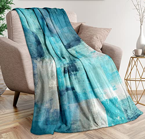
Lastly, if you’re aiming for a cohesive look throughout your space, exploring cool greys can accentuate the richness of the wood while imparting a modern flair. Pairing these tones with textured throws or decorative pillows will add layers of comfort and style, enhancing the overall design of your bedroom.


Color Pairings for Bedding and Dark Furniture
Opt for shades of white or cream to create a striking contrast against deep finishes. These light tones enhance the richness of your setup, giving a fresh and crisp appearance.
Pale blues or soft greens introduce a serene vibe, promoting a calming atmosphere. These hues work well, adding a touch of coolness that balances the warmth of darker components.
Rich jewel tones, such as emerald or sapphire, present an elegant choice. They create a sophisticated look, especially when paired with gold or silver accents in your room.
Earthy tones like terracotta or muted browns can harmonize nicely. These shades enrich the visual appeal, blending beautifully with the richness of darker grains.
Patterns such as stripes or floral prints in lighter shades can add depth and interest. Choose designs that incorporate colors mentioned above to maintain cohesion and enhance the aesthetic charm.
Textured fabrics like linen or velvet can enhance the overall look. Combining textures with carefully selected hues elevates the space, adding luxury and comfort.
Choosing Neutral Shades for a Balanced Look
Opting for shades such as soft beige, light gray, or ivory creates a harmonious atmosphere. These hues allow the richness of the deeper tones of your pieces to stand out while maintaining an inviting, cozy environment.
Texture Matters
Incorporate various fabrics, such as linen or cotton, to add depth and interest. A textured neutral blanket or several throw pillows can enhance the overall aesthetic without overwhelming your space.
Accent Options
Add pops of color through accessories like throws, artwork, or decorative cushions. Earthy tones like terracotta, muted greens, or soft blues can complement neutral shades beautifully, creating a cohesive but dynamic feel.
By focusing on balanced tones, the overall look remains elegant and sophisticated, ensuring the wooden elements serve as a striking focal point in the room.
Complementary Hues that Enhance Wood Tones
Opt for rich jewel tones such as emerald green, sapphire blue, or deep burgundy to create a striking contrast. These shades pair exceptionally well with the warm undertones of dark timber, adding sophistication and elegance.
- Emerald Green: This lush hue brings a sense of depth and luxury, enhancing the natural grain of darker surfaces.
- Sapphire Blue: A regal blue adds a striking contrast while maintaining a serene atmosphere in the space.
- Deep Burgundy: This warm, rich red offers a cozy feel, creating a harmonious balance with the furniture’s texture.
Consider incorporating soft pastels for a lighter, airy ambiance. Light blush, soft lavender, or pale aqua can brighten the room while complementing the darker elements.
- Light Blush: This subtle pink adds warmth and softness, providing a gentle contrast to dark finishes.
- Soft Lavender: This delicate shade introduces an air of tranquility, effortlessly harmonizing with rich furniture.
- Pale Aqua: A refreshing choice that lightens the overall aesthetic while enhancing the richness of dark woods.
Neutral tones like taupe, cream, and light gray serve as timeless companions, ensuring a balanced appearance that allows the furniture to remain a focal point.
- Taupe: This earthy shade brings warmth without overwhelming the decor and complements various textures.
- Cream: A classic choice that adds brightness and elegance, promoting a refined atmosphere.
- Light Gray: Utilizing a soft gray can create a modern vibe, providing a sleek background that enhances the richness of the wood.
Utilizing Patterns to Add Depth and Interest
Incorporating patterns is a powerful way to enrich the visual appeal of your space. I recommend selecting prints that resonate with the overall theme while complementing the rich tones of your furniture. For instance, geometric patterns bring a contemporary edge, creating a striking contrast with the rustic nature of natural finishes.
Textural complexity can be achieved by mixing stripes and florals. A classic approach is to choose a bold striped duvet cover paired with floral accent pillows, invoking a sense of movement without overwhelming the senses. Keep the palette cohesive, ensuring that all pieces share a common color story to maintain harmony.
Don’t shy away from using abstract designs. These can create focal points that draw the eye, making the room feel more dynamic. Incorporate such designs on a throw blanket or a handful of cushion covers, balancing them with solid hues to create a visual rhythm throughout the bed setup.
Layering different types of patterns is also advisable; however, I suggest varying the scale. Pair large motifs with smaller prints to prevent clashing. For example, a large paisley print can be beautifully complemented by tiny polka dots or delicate lines for a stunning visual contrast.
Ultimately, the key lies in the thoughtful combination of patterns, ensuring they add depth and interest without competing for attention. This strategy not only showcases your unique style but also enhances the warmth and character of your sleeping space.
Seasonal Color Trends for Bedding with Dark Wood
For autumn, I recommend rich earthy shades like burnt orange or deep burgundy to create warmth and a cozy atmosphere. Pair these hues with neutral accents to balance the boldness of the bedding, enhancing the richness of the furniture grain.
Winter Aesthetics
In winter, opt for crisp whites, icy blues, or even forest greens. These shades evoke a serene winter ambiance, working harmoniously with the darker tones of the wood. Layer with textured throws for additional warmth and interest.
Spring Inspirations
Spring calls for soft pastels such as blush pink or mint green. These lighter tones refresh the space and offer a lively contrast to the dark elements. Choose botanical prints to add a natural touch, harmonizing beautifully with the warm undertones of the wood.
Summer vibes can be captured using vibrant shades like sunny yellows or rich teals. This energetic palette brightens the room, making it feel lively while maintaining a grounding effect against the dark hues of the furniture. Accentuate with striped or geometric patterns for a playful twist.
The Impact of Textures on Bedding Choices
Choosing the right textures for your linens significantly elevates the aesthetic and comfort level in your sleeping space. I recommend incorporating a variety of materials to create depth and sensory interest. For instance, pair smooth satin pillowcases with a chunky knit throw for a striking contrast that catches the eye.
Key Textures to Consider
| Texture | Effect |
|---|---|
| Cotton | Softness and breathability |
| Linen | Natural, relaxed look |
| Satin | Luxurious sheen |
| Knitted | Cozy and inviting |
Layering Techniques
Layering different fabrics not only adds visual interest, but also enhances comfort. Combine a tactile woven duvet with silky sheets for an appealing contrast. Additionally, consider incorporating textured cushions to break the monotony of flat surfaces. This approach fosters a warm and inviting atmosphere, perfect for relaxation.
Mixing Bedding Colors for a Cohesive Room Design
Incorporating shades that contrast with deep tones can create an inviting atmosphere. Opt for hues like soft beige or light grey to balance the richness of the furniture. These tones not only provide a neutral canvas but also enhance the overall aesthetic.
When pairing with bold colors, think of using muted versions. Soft blues, dusty rose, or warm taupes can beautifully offset the intensity of darker woods, making the space feel harmonious and well-composed.
Layering different shades can add depth. Start with a foundational tone, such as ivory, and introduce various accessories like pillows or throws in varying saturations of the same palette. This technique fosters cohesion while maintaining visual interest.
Consider the overall mood you wish to evoke. For a calming retreat, cool shades work well, while warmer palettes can create a cozy, inviting vibe. Keeping the tones within a similar spectrum can ensure that every element feels connected.
Lastly, don’t shy away from using unexpected hues as accent pieces. A striking mustard or emerald can introduce a playful contrast that draws the eye without overwhelming the space. Just ensure that these pops of color remain balanced by your primary choices.
FAQ:
What color bedding should I choose for dark wood furniture?
When selecting bedding for dark wood furniture, consider lighter colors that create contrast, such as whites, creams, or light grays. These colors can brighten the space and add a fresh feel. Additionally, soft pastels like blush pink or baby blue can bring a gentle, soothing vibe. If you prefer a bolder look, deep jewel tones like emerald green or navy blue can complement dark wood and add richness to the room.
Can I use patterned bedding with dark wood furniture?
Yes, patterned bedding can work beautifully with dark wood furniture. Look for patterns that incorporate colors complementary to the wood tones. For example, floral or geometric designs with hints of white or light colors can create a nice balance. However, be cautious with busy patterns, as they may overwhelm the space. Aim for a cohesive look by choosing bedding that harmonizes with other elements in the room.
Are there any colors I should avoid when pairing bedding with dark wood furniture?
While personal preference plays a big role, it’s generally advisable to avoid very dark colors that blend in with the wood, such as black or dark brown. These can make the space feel heavy and closed in. Additionally, overly bright colors that clash with the rich tones of the wood, like neon shades, might create a disjointed look. Soft neutrals or balanced colors are typically your best bet.
How can I incorporate textures in bedding with dark wood furniture?
Incorporating textures is a fantastic way to enhance the overall design of your bedroom with dark wood furniture. Opt for bedding made of materials like linen or cotton for a soft feel and breathable quality. Layering different textures, such as adding a chunky knit blanket or decorative pillows with different fabrics, can create visual interest and depth. This approach helps soften the look of the dark wood while adding warmth and comfort to the space.
Is it a good idea to match my bedding color to the wood furniture?
Matching your bedding color to dark wood furniture can create a seamless look, but it’s important to consider contrast as well. Instead of exact matches, opt for shades that are in the same color family but lighter or more muted. For instance, if your furniture has warm undertones, consider warm beige or soft taupe bedding. This way, you create a cohesive aesthetic while still allowing the bedding to stand out and add dimension to the bedroom.
What are the best color bedding options to pair with dark wood furniture?
When choosing bedding to complement dark wood furniture, a variety of colors can work beautifully. Light and neutral shades such as whites, creams, and beiges provide a soft contrast that balances the richness of dark wood. Alternatively, jewel tones like emerald green, deep blue, or burgundy can create a sophisticated and inviting atmosphere. Soft pastels, including light pink or pale blue, can add a gentle touch without overpowering the wood’s natural beauty. Additionally, incorporating subtle patterns or textures in your bedding can bring depth and interest to the overall design.