Select colors and textures that complement the hue of the timber beneath. For light oak or maple varieties, opt for softer shades in your seating and tables. Warm tones of beige, cream, or pastel colors can enhance the natural grains, creating a light and airy atmosphere.
Consider the style of your surroundings. If the timber is rustic or reclaimed, organic shapes and natural textiles will harmonize beautifully. Look for pieces crafted with wood, rattan, or linen to maintain that cozy, natural feel.
Pay attention to the finish of your chosen items. Matte finishes typically create a casual setting, while glossy surfaces can add a touch of elegance. Strive for balance: too much shine may compete with the natural beauty of the timber, so experiment with various finishes to see what feels right.


Proportion and scale also play a key role. Larger, bulkier pieces will need to harmonize with the expanse of your surface. Use larger items to anchor the space while layering in smaller accents to prevent visual clutter. This method ensures that your arrangement remains inviting and functional.
Coordinating Decor with Timber Surfaces
Select pieces that create a harmonious visual experience. If the planks are dark, choose lighter tones for the items, such as beige, cream, or light gray. This contrast can highlight features of both the surfaces and the items, ensuring that neither feels overshadowed.
For a cohesive atmosphere, consider the grain and texture of the materials. A sleek, smooth table can act as a stylish counterpoint to a rustic or matte natural setting. This interplay between finishes adds depth to the design.
Color Palette Considerations
Integrate colors from the room’s palette. If your flooring has warm undertones, incorporate warm-hued accents through curtains, chairs, or decorative elements. Conversely, cool wood types thrive alongside shades of blue or green, enhancing each element’s presence.
Layering with Accessories
Introduce textiles and accessories to unify the space. Rugs, throw pillows, or wall art can bridge any gap created by varied tones. Natural fibers, like jute or cotton, harmonize beautifully with most materials, providing an inviting softness that contrasts with wooden grains.
Assessing the Wood Floor’s Color and Grain
I focus on identifying the exact shades and patterns of the planks beneath my feet. A light oak can enhance the airy feel of a space, while a dark walnut introduces warmth and sophistication. I consider whether to complement or contrast with fresh pieces. For lighter woods, I lean towards soft pastels or light neutrals for modern aesthetics. Darker options invite richer hues like deep blues or greens, creating a sophisticated ambiance.
The grain texture also plays a significant role in my selections. A pronounced grain adds character and may guide my choice towards simpler designs for seating or tables to avoid overwhelming the eye. Conversely, smoother finishes pair nicely with detailed patterns in textiles or accessories, striking a balance between elegance and comfort. I take note of grain variations, ensuring the new additions resonate with the existing pattern of the flooring.
I explore the undertones as well, observing whether the base tones lean towards cool or warm. For instance, a floor with warm undertones could harmonize beautifully with golden or earthy tones in new pieces. This attention to detail ensures a cohesive look throughout the room. I often bring home samples to see how different materials interact under natural and artificial light, making adjustments based on the evolving appearance as the day progresses.
Choosing Furniture Styles That Complement Your Floor
To enhance the beauty of your surface, select pieces that feature clean lines and simple designs. Minimalist styles, characterized by their understated elegance, can create a harmonious atmosphere. Consider Scandinavian aesthetics that often incorporate natural elements, seamlessly blending with the texture beneath.
Incorporating Color Palettes
When choosing tones, opt for shades that either contrast or harmonize with your natural finish. If the surface is dark, light-hued elements can add a striking visual appeal. Conversely, rich, warm tones can enrich the ambiance if the base is lighter. Use accents–like cushions or throws–that echo colors found in your foundation to create continuity.
Texture and Material Considerations
Incorporate contrasting materials for added depth. For instance, if using smooth, polished pieces, weave in textiles like soft wool or linen to soften the look. Metallic accents can introduce a modern vibe that complements rustic grains. Each texture adds an additional layer, creating a rich, layered aesthetic that draws the eye.
Selecting the Right Furniture Finish and Tone
I prioritize the finish of each piece as it significantly impacts the overall aesthetic. For harmonious ambiance, I often pick a sheen that resonates with the surface characteristics. A matte finish can soften the look, whereas a glossy sheen can add a touch of contemporary elegance.
The tone should either blend seamlessly or provide a striking contrast. When dealing with light-toned surfaces, pale or natural finishes work wonders. Darker surfaces, on the other hand, benefit from rich, warm tones that can create depth and harmony. I also pay attention to undertones; for instance, if the ground has subtle gray aspects, I lean towards cooler finishes for the larger pieces.
Textures and Surface Interactions
Integrating varied textures enhances visual interest. I find that combining smooth surfaces with carved or distressed finishes can create a layered effect. For example, pairing a sleek table with textured chairs introduces complexity without overwhelming the eye. The interaction between surfaces often dictates the room’s vibe; I tend to avoid overly slick combinations that can feel sterile.
Adjusting for Lighting Considerations
The lighting in the space plays a pivotal role in how tones and finishes appear. In bright environments, I choose slightly darker or richer finishes to prevent the items from appearing washed out. Conversely, in dimmer spaces, lighter finishes can brighten the area, making it feel more inviting. I always experiment with various lighting scenarios to see how the pieces interact under different conditions.
Using Textures to Enhance the Wood Floor Aesthetic
Incorporating various surfaces can significantly elevate the overall look of a space with timber elements. Opt for materials such as leather, linen, or cotton that create tactile contrasts, enhancing depth and interest. For instance, smooth, polished finishes on seating can juxtapose beautifully against a naturally rough timber surface, creating visual and physical depth.
Layering soft textiles, such as plush rugs or throw blankets, can soften sharp lines and add warmth. This layering also helps break up larger expanses of wood, drawing attention to specific areas and adding a cozy feel. Explore different patterns and prints to introduce playful dynamics that can counterbalance more muted wood tones.
Here’s a selection of materials and textures that pair beautifully to enhance the timber aesthetic:
| Material | Texture Description | Visual Effect |
|---|---|---|
| Leather | Smooth, sleek finish | Adds sophistication and contrast |
| Cotton | Soft and breathable | Creates a relaxed, inviting atmosphere |
| Linen | Textured, slightly crisp | Brings a natural element, complementing rustic wood |
| Wool | Warm and plush | Softens the aesthetic, adding coziness |
| Metal | Cool, reflective | Introduces a modern edge, enhancing elegance |
Experiment with tactile elements through cushions, panels, and accent pieces. For a harmonious look, prioritize complementary colors while respecting the grain and tones of the timber. Be mindful of the scale and weight of different textures, ensuring a balanced composition throughout the space.
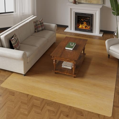
Incorporating Area Rugs to Bridge Between Furniture and Floor
Choosing area rugs can significantly enhance the connection between your seating and surfaces. Select rugs that resonate with the color palette of your room, ensuring they complement both your upholstery and the natural hues of the ground underneath. A neutral-toned rug not only grounds the space but also allows vibrant chairs or sofa colors to stand out.
Consider size carefully; your rug should ideally extend beyond the edges of your main seating arrangement to create a cohesive look. This technique unifies the elements in your area, tying together the arrangement while simultaneously defining it.
Patterns can play a vital role in this interaction. If your seating features bold designs or textures, a simpler patterned rug can balance the visual weight. Conversely, if your seats are relatively plain, a striking rug with elaborate motifs can inject energy into the environment.
Placement matters. Positioning your rug under the front legs of the seating fosters an intimate feel, while centering it within the space can open up the room, drawing attention to key features such as coffee tables or decorative accents.
In terms of materials, selecting a durable yet soft texture contributes to comfort. Natural fibers, like wool or jute, offer a cozy feel and are easy to maintain, making them suitable for high-traffic areas.
Before finalizing your choice, visualize how the rug interacts with both the structure and the overall atmosphere you aim to create. Effective layering of textures, colors, and patterns will bring a harmonious element to your room, enhancing the overall aesthetic appeal.
Balancing Scale and Proportions with Wood Floors
To achieve harmony in a space, it’s crucial to consider the dimensions and scale of your décor in relation to the surroundings. Here are specific tips to create a balanced aesthetic:
Assess Size and Layout
- Measure the area meticulously. Larger rooms can accommodate larger pieces, while compact spaces benefit from smaller, streamlined options.
- Keep a clear visual path. Avoid overcrowding by ensuring there is enough space for air flow and movement.
Visual Weight Considerations
- Utilize lighter-toned items in small areas to create an illusion of openness, contrasting darker hues that may feel heavier.
- In larger spaces, incorporate a mix of robust and delicate items. For instance, a sizable dining table can be complemented by slimmer chairs.
By carefully selecting dimensions and visual heft, you can enhance the beauty of your space while establishing a cohesive environment that feels intentional and inviting.
Creating Visual Harmony with Accessories and Decor
Incorporating the right accessories enhances aesthetics and creates an inviting atmosphere. Focus on a limited palette that resonates with the tones in your chosen surfaces. Selecting accent pieces that share similar undertones or contrast thoughtfully can create balance.
Key Accessories to Consider
- Artwork: Choose pieces that reflect hues found in your surface materials, ensuring they harmonize without overwhelming the space.
- Cushions and Throws: Opt for textiles that provide a pop of color or texture, complementing the existing decor without clashing.
- Lighting: Utilize fixtures with warm tones to enhance the cozy feel of surrounding surfaces, while highlighting specific areas.
- Plants: Greenery introduces natural elements, offering a refreshing contrast to hard surfaces and softening the overall look.
Layering Techniques for Depth
Introducing layers through various elements adds dimension. Utilize variations in heights and materials to create a dynamic visual experience:
- Incorporate decorative shelves or wall-mounted units to display smaller items, drawing the eye upward.
- Mix different materials, such as glass, metal, and soft fabrics, to enrich the tactile experience within the space.
- Add a layered approach with multiple light sources, varying in height and intensity, to create warmth and contrast effectively.
Final touches can be achieved by selecting unique items that resonate with both style and personal preference, ensuring a cohesive yet personalized look. Adopting these strategies leads to a comfortable and aesthetically pleasing environment.


